Pages

Friday, November 22, 2013

Kindergarten: Jasper Johns' OIl Pastel Numbers

The second official project that kindergartner's finished up before my leave was this Jasper Johns number project.  This is a repeat project that I did from last year, with some alterations.  Last year I was able to spread this out into more of a complete unit because I saw students twice a cycle, but this year I didn't feel I could spend that amount of time on this project, so I shortened it and altered it a bit more to fit within the Kindergarten Common Core Math standards. 

This project took about 2 1/2 days for most students to complete.  On the first day, I showed students my power point about Jasper Johns and we talked a bit about pop art.  One of the math standards for kindergarten is being able to count objects that are in a row, a column, a grid and in a random assortment, and then write the appropriate number.  To mirror that, I paired students up and gave them a brown bag filled with 9 wooden beads of different sizes.  One at a time, I had the students pull out a handful of beads, count them and write the number down in the first square on their paper in pencil.  Their partner was supposed to double check their counting and the number they wrote.  They alternated until each partner had their six squares filled with a number.

For the second class, I passed these back and showed the students how to turn their numbers into bubble numbers.  For their next set of directions, they were asked to choose ONE oil pastel color to color in their numbers.  For the most part, everyone followed that direction quite well.

The final portion of the second class and the subsequent class was to color in the background.  My directions were that students were supposed to choose THREE oil pastel colors to color in the background behind their numbers.  This is where some students didn't follow directions, or appeared to not be able to follow directions.  Many students grabbed an oil pastel and started coloring right over the top of their numbers.  Some colored around but used more than three colors.  I gave multiple demonstrations at each table to try and show students how to color AROUND their details, but many still struggled, so I sense that this is something that this group will need more work on!


Studio Art: Reduction Prints Progress

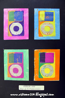
Here is a sneak peek at the progress of my Studio Art's pop art reduction prints before I left on my maternity leave.  I expect that they should be just about finished by this point...  I required that they make a total of 10 prints and that they must have at least four colors in each print.  When I return, they will have to turn in their four best prints and I'll teach them how to properly mat their projects using a mat board cutter.
This student chose to use an iPhone app as her pop art...any guesses?


I'll probably sneak over to school this weekend to check out project progress and to pick up some books I ordered for Christmas presents from a fund raiser...can't wait to see their progress!

Wednesday, November 20, 2013

Volcanoes!

My maternity leave started on Monday this week...no baby yet as my due date is next Friday, but I was definitely ready to be done with school...and a little more at ease with leaving after my maternity sub was hired and followed me around all last week.  Phew!  (For the sake of ease, I'm going to call my sub Miss Y.)

I've got a few posts that I'm working on to share projects that were finished up (or in the process of being finished) Friday when I left school.  One of the projects that my substitute started right away was with the K-3 12:1:1 class.  They had been BUGGING me to no end to do a volcano project, so I mentioned this to my sub and she decided to build volcanoes with them.  (I'm actually quite jealous that she gets to do this project with them!)

I had originally thought to use toilet paper tubes in the center, but Miss Y decided to use water bottles instead...that way they could actually use them to make them erupt!  I was there for this first day, and I can't wait to see how they turn out when I return!

We gave each student a piece of cardboard as a base and Miss Y hot glued the water bottles to the center.  We had the students crumple up newspaper and tape it around the water bottle to build up the mountain of the volcano.  Finally, the students used Plasticraft plaster strips to dip into water and cover the newspaper.


Next class the students will be painting these.  Can't wait to see how they turn out!

Thursday, November 14, 2013

Art 7: Final Sketchbook Tags

Seventh graders finished their graffiti sketchbook tags last week, right before 10 week grades were due.  Here's some of their sketchbook covers!  You can see the rest of them on Artsonia...


Hehe...my belly was in the way of this photo!


Art 7 classes have now moved onto the 1-point perspective and I'm getting mixed reviews with this.  My maternity leave sub has been shadowing me and taking over my classes this week (tomorrow is my last day at school!) and she is comfortable with perspective, which is great, but the students themselves are not trying very hard.  Well, I should say that one of the classes seems to be enjoying it and understanding it quite well, whereas the other class is, well, not.  At this point, it will be up to her if she wants to try and continue with the perspective project or if she wants to do something else with the "whiny" Art 7 class.  

Wednesday, November 13, 2013

2nd Grade: Imperial China Still Life Paintings

For 2nd grade's second project of the school year, they learned about Imperial China and the origins of blue glaze.  This corresponded with the NYS Common Core Listening & Learning Strand of Early Asian Civilizations, so it was a perfect lesson to use!

I did this project two years ago and pulled it out of storage for this group.  Unfortunately, I have yet to receive my clay that I ordered (it was never ordered by my business office over summer...luckily they were still able to get it for me though!), otherwise I would have actually done real pottery and blue glaze with the students.

This project essentially took us 2 1/2 days to complete.  Students received about 15 minutes to finish up their castle collages and then I showed them a power point about Imperial China.  Students went back to their tables, chose a vase to trace, and then drew their vase design on it.  During the power point, I stressed the importance of nature on their pottery, which the students were then able to connect to their religion, which was an A+ in my book on connecting to that Common Core!  Students were supposed to create a design that included nature and decorative patterns, just like the pictures of the vases we looked at in the power point.

On the second day, I taught students about tints and shades.  I gave each table an egg carton with blue, white and black paint and then let them go to town mixing colors to paint their vases.

On the last day, students cut out their vase.  They cut a piece of construction paper in half hot dog style and glued it to the bottom of colored tag board.  We talked about placement of the vase and glued that into place, leaving plenty of room to paint flowers.  I stressed that the vase should NOT sit directly on the horizon line, but also not directly on the bottom of their paper.  Finally, I gave students colored tempera to paint their flowers.


Now, here's my reflection on this project.  The original vase drawings and designs were very good.  They were all nature related, had some great dragons drawn, etc.  However, when it came to painting those finely drawn details, the students struggled.  That's something I'll keep in my for future painting projects to try and teach more in depth.

I just wanted to share these other two paintings...One 2nd grade class had the third day of the project taught to them by a non-art certified substitute teacher...a sub that is very on top of things with the students.  All of the other paintings above came from the other 2nd grade class, taught the last class by myself.  ALL of the still life paintings (except for maybe 4 of them) from the first 2nd grade class had flowers painted like these two...flowers painted around the vase instead of like they are in the vase.  I used the same examples when I taught the class as what I left the substitute.  It will be interesting to see if this trend of understanding continues as the year continues!

Wednesday, November 6, 2013

Studio Art: 2-D Media, Printmaking

Now that we have finished up the cubist superhero paintings, the last and final aspect of my 2nd unit in Studio Art is the printmaking portion.  For this unit, we are covering Andy Warhol, pop art, and reduction printing with linoblocks (I don't have all of the materials to do screen printing, nor am I as familiar with screen printing, otherwise I had considered doing screen printing like Andy Warhol).  This will probably be the last project I get completed with this class before my maternity leave.
My Studio Art bulletin board in the classroom.  

My example of a reduction print.  I did this during my student teaching with a printmaking class.

For the first two days, we have been working on planning out our pop art object print.  Students were required to bring in an object or photograph of a person/character from pop culture today.  (Some of the items that have been used are baseball caps, the bear from the movie Ted, a rubics cube, Minions, etc.

After students draw out and plan what their finished print will look like, I have them plan out each step of the reduction print process using tissue paper layers.  The first step is to make a print of their entire linoblock.  If there is anything they want to keep white for every print, they must carve it out first.

The second step is to carve away the area around the object so that you just have the contour of it.  

For this project, I am requiring that they have at least four colors/steps in their prints, like my Coca-Cola can.

Another example I did during my student teaching.  I created this and took a photo of every step to create a visual poster with directions.  This particular reduction print had six steps to it.

These are three student samples from my student teaching.  I did this with a printmaking class that had only 3 students.


Here are the close up shots of my visual poster that I had made.  Sorry for the bad photos...it was laminated and didn't photograph very well under the poor lighting at school.
Draw the design on the block, carve out anything that needs to stay white, and make your first print.

Carve out the area around your object...make your second print...


So, basically by the end, you have nothing left on your linoblock!

Currently the Studio classes are working on making their 10 background prints.  Those are due by the end of class today.  Tomorrow, we'll carve out the area around their object and I'll show them how to carefully line up their block with their first print to layer the second on top.  When finished, students will have to submit to me four of their best prints and eventually we will mat them (whether my maternity leave sub is comfortable teaching that or it waits until I return to school...)