Sunday, November 6, 2016

Studio Art: Zentangles

First official Studio Art project of the year was zentangles.  Yes, zentangles.  I know this word is a cause of debate among a lot of art teachers, and this year, it even caused a bit of a debate among my students, which actually made me quite happy!  Whether you call it zentangling, or doodling, or drawing, or whatever, the idea behind it is to be relaxed, have fun, and draw about something that interests you.  I have done a few different versions of zentangle/doodle projects with my students over the last three years, but this year, I felt like they made it more their own.  In all honesty, I think my open-ended visual journal assignments have had a hand in this.  So, let me explain what I mean.

I use the zentangle unit as a confidence booster.  My Studio Art classes are primarily filled with students who HAVE to be there for the credit to get the Regents Diploma.  Aside from the few music students who ask to take my Studio Art classes, most of them think they have no artistic ability, nor do they really want to be there.  I'm happy to say that I'm already changing some of their minds about art!

Anyways, we begin the unit by looking at Kerby Rosanes and his doodle art.  We talk about how he turned something he enjoyed doing as a hobby into his job, how his creative process works, and how he organizes his artwork.  I use this unit as a way to review the elements and principles of art and to talk about composition.  Then, the students learn about zentangling.  I have tons of books about zentangling, as well as daily brain activity cards that teach a new zentangle pattern, step-by-step.  They really enjoyed using those cards.  These are a few of the zentangle tiles the students completed at the beginning of the unit.  (Mind you, at this point we have not dove into value, so anything you see here is what they remember from 7th grade.)

Next came the actual unit project.  In my effort to be more choice based this year, students were allowed to incorporate anything into their design that they wanted.  I encouraged them to send a message with their work or to use a subject that interested them.  Most of the time I hit resistance here because they don't know how to concentrate their ideas into something doable, but I think the open-ended visual journals that we started the year off jump-started their noggins, because every student managed to come up with a great idea!

I also mentioned that it caused a bit of a debate.  In past years, students embraced the zentangle name because it was an interesting word and many of them were very literal, enjoying the step-by-step process behind zentangles.  This year, I had quite a few challenge me.  "Why do we have to follow steps?  Can't we just draw?" "Seriously, I already do this kind of stuff in my notebook, see Mrs. Impey..."

And this, of course, led to discussions about marketing, branding, what makes something art, and so on!  It was great!  Aside from having an obvious subject and focal point in this work, I did require them to use patterns in a way to enhance their work, whether they called them zentangles or not, because it forced them to think about composition and those principles of art.  I didn't push the use of the zentangle cards or books (except for bell ringers, which I'll share in my next post), to get the artistic juices flowing.


She comes from a farming family. ;)

Sarge and Tahlia are his family's dogs.

This one and the next come from a couple of gamers.


This student incorporated some of her own poetry!

And this one is very religious.

She incorporated the first letter of her first name.

The one of the left came from a sports student, and on the right, another gamer.

Coming next will be a post about our bell ringers!

Sunday, October 23, 2016

Art History: Ancient Egypt

In Art History, once we finished up with prehistoric art, we moved on to Mesopotamia and then Ancient Egypt.  So far, even though we only meet every other day, we are keeping on track extremely well with my planned out timeline for the school year.  We have three more weeks left for the first quarter and my goal is to cover Ancient Greece by the 10 week marking period.  We just finished with the Minoans and Mycenaean, and will be starting Greece on Tuesday this week.

Here is my student's diorama for Egypt, as well as her essay.  At this point, I will start going through her essays to point out areas that she could elaborate on her ideas, and I plan on teaching her the Chicago style of citations (footnotes and end notes).  For her next essay, I'm going to require her to use citations as well as cite the textbook we are using in her essay.  We will build slowly from there!

         Ancient Egypt is, by far, one of the most impressive cultures in history.  From the sky-high pyramids, to the mummification of their dead, tot he solar religion system, Egypt has obviously amazed archaeologists, historians and even artists for centuries.  The ancient Egyptian style of art is shown through paintings and carvings on the inside of pyramid walls, sculptures created to honor gods and the dead, and the actual structure of their buildings, such as pyramids.  Throughout this unit, I learned all about the culture of Egypt, which helped to further my understanding of the artwork from this time period.  The ancient Egyptians used techniques that differentiate their art from other cultures around this time, such as the canon of proportions--a twisted perspective of the human body, showing a front view of the shoulders and torso, a side view of the head, hips and legs, and identical hands.  Gods and goddesses are shown with human bodies and animal heads in all Egyptian artwork.  What truly amazed me about the Egyptians is their idea of permanence.  Temples and artwork alike were created very strategically and with much thought in order to assure that they would last forever.  This idea is also shown through the mummification of the dead, as a way to prepare their people for a permanent afterlife.  Ancient Egypt has had a great impact on the world of history, religion, and art.

          For my Ancient Egypt project, I I decided to decorate a diorama to look like the inside of a pyramid.  To achieve the ancient pyramid feel, I used spray paint in yellow and red to create a golden look to the pyramid walls on both the inside and outside of my diorama.  Inside, I painted a large depiction of Egyptian artwork on the back wall, with two men and a god shown in a line.  To make this look extremely realistic, I used the cannon of proportions to paint the figures.  Their heads are shown from a side view, although their bodies appear to be from the front view.  The god I painted has a bird mask for a head, as Ancient Egyptian art depicted gods and goddesses with animal heads.  On the two side walls of my pyramid, I painted hieroglyphics as a writing form, but the writing style they sued includes shapes of objects rather than letters.  Symbols I used include the eye, hands, and a turtle. I also created an Egyptian pharaoh in a sarcophagus out of modeling clay, dusted with gold and blue pigments to give it a shiny appearance.  Surrounding the Egyptian sarcophagus are four jars, also made out of clay, which would have been used to hold the mummy's stomach, liver, intestines, and lungs.  These jars are decorated to represent the head of the mummy.  Ancient Egyptian culture has had a major impact on cultures throughout history, and the world.

Monday, October 17, 2016

Visual Journals 5 Weeks: Mind Map

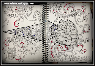
The final visual journal assignment that was due at the five week marking period was called Mind Map.  I asked students to take this right brain / left brain quiz and then illustrate their results. (There is also an app for the iPad for this particular quiz.)  This, of course, required them to do a little research to understand what the right and left parts of the brain did.  This project really stressed a lot of them out.  If they didn't know what it meant to be right brained, they would ask me, and I would tell them, "Go look it up on the iPad." Which would result in a lot of whining. Some days, I literally had to tell them not to ask me any questions, consult the document in Google Classroom, or ask their friends, at least with the 7th graders.  (My 7th graders this year is a pretty needy group...perfectionists...almost feels like they've been hand-fed and they aren't used to doing things on their own anymore...we are slowly breaking down that barrier in the art room!)
  
Now, I know that there are some arguments out there that the right brain / left brain theory is an old one and doesn't apply anymore, but I think there is value to this.  First, I wanted students to have an unbiased idea of how they think.  Most thought they would be left brained, but when they took the quiz THE FIRST TIME, it showed they were more right brained.  (Obviously, they would then take the quiz again and skew their results...so if you do this with your students, only allow them to take the quiz ONCE.)  Many were surprised that they were 50/50.  Some weren't surprised at all that they were mostly left brained.  Once they took the quiz, we were able to talk a bit about what that meant for them in art class.  If they are more left brained and mathematical, I would expect that they may like to draw using grids and rulers...perfectly ok!  I had hoped that by doing this assignment, it would put them more in tune with how they think and what comes more naturally to them so that they could then apply that thinking to their assignments.

Here is my finished Mind Map assignment.  :)


One of the few students who didn't want to use a brain in their image.


Absolutely loved this one!!!  Though I think she may have skewed her results because she definitely has more right brain in her than she thinks she does!


One of my Drawing & Painting students.  Absolutely love her take on this assignment!  She's the only one who actually used a head!

Drawing & Painting student with an AMAZING line drawing!


7th grader...the same with the fabulous graffiti name from the previous post.


Now, again, many of these weren't horribly interesting with design, using mixed media, or brimming with creativity, but they were a great place for us to start having a conversation as a class and to work on critiquing ourselves and others.  Later this week, it's my goal to have students upload these to Artsonia using classroom mode and answer a few questions to write their artist statements, and then look at what the students created from the other classes.  Round one of visual journal assignments is OVER!