Showing posts with label line. Show all posts

Friday, September 19, 2014

Studio Art: Unit 1, What is Art?

Over the summer, I did manage to do a little revamping to my Studio Art units.  Last year I had them categorized as the following:
Unit 1: What is art?
Unit 2: 2-D Art
Unit 3: 3-D Art
Unit 4: Ceramics
Unit 5: Zentangles

This year, I have shortened the units in order to break up the information a little more.  I have also rearranged a few of my projects.  This is what my unit order will look like this year:
Unit 1: What is art?
Unit 2: 2-D Art: Drawing
Unit 3: 2-D Art: Painting
Unit 4: 2-D Art: Printmaking
Unit 5: 3-D Art: Sculpture
Unit 6: 3-D Art: Ceramics


This post is basically a quick recap of what we have accomplished for the first unit in the first two full weeks of school.  Much of my original unit is still the same...I use the Art Talk text book (ugh!) to do the first half of the note packet, which is about why artists create art (to be functional, for express oneself, for religious purposes, etc.) and where artists find inspiration from (the person paying them, their culture, world events, past artists, art media and styles, etc.).  Once this was accomplished, I assigned a sketchbook assignment for the weekend.  A fellow art teacher in my county suggested this book at one of our last staff developments.  It has some awesome ideas!  

Unfortunately, this was assigned after two days of school...a time period when a lot of students didn't have their sketchbooks yet (even though it was on their supply list...sigh).  Quite a few were completed on lined paper or computer paper and have already been lost. :(  Here are two though...sorry for the bad pictures!
Mine is the unfinished one on top. :(  The weekend I gave this assignment, my mom's dog was hit by a car and I wasn't thinking...I ran out to the road to scoop her up and she bit me.  I was out of commission from being able to really do any drawing or typing for about a week until it started to heal up.

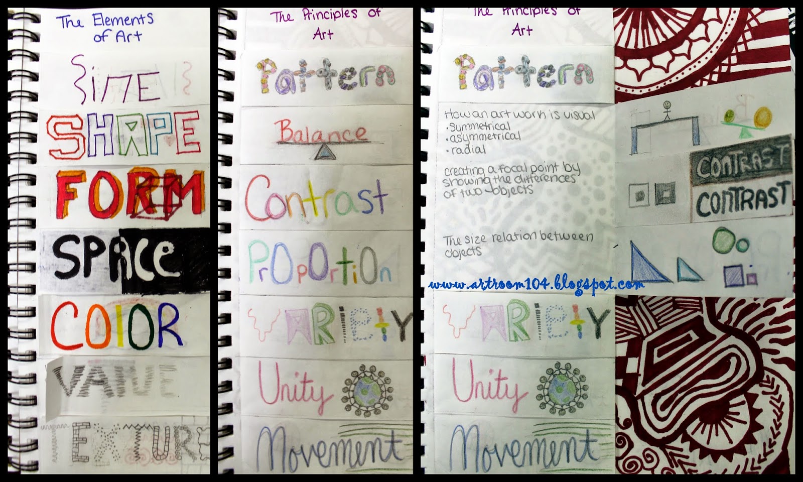
For the last week and a half, the students have been working on infographics...one for the elements and one for the principles.  I am really trying hard to use sketchbooks EVERY DAY in Studio Art.  Last year I dwindled off on assignments in them and it was virtually pointless to ask students to use them.  (Stay tuned for future posts about how I am using sketchbooks every day!)  If you've been following me for a while, you'll remember the elements of art infographic I had students do last year.  They did these on a separate piece of drawing paper and eventually lost them of threw them out.

This year, I required the students to build them right into their sketchbooks so that they would always have them!  I also required them to make one for the principles of art.  Last year my students did not know these and when we tried to do critiques, it was very difficult to talk about the art.  Here are a few examples, including my own!
My examples of the two infographics.


The second sketch assignment I had students do was a non-representational line design.  This was assigned after their introduction to the elements and principles infographic project.  Again, this is a repeat assignment from last year.  Students were asked to use only one color and line to create an interesting design.  Some students strayed outside the project parameters and used more than one color, but in all honesty, their designs ended up being more successful than some of the single colored ones, so I didn't dock them on the rubric.  This sketch assignment then opened the door for the final project of the unit...zentangled master's paintings!

 I use a standard rubric for sketch assignments that is worth 16 points.  Students are assessed on following assignment criteria, using the elements and principles, creativity/originality, and craftsmanship.  I try to write a comment on all rubrics before passing them back...another one of those things I can check off my Marzano checklist!

The zentangled paintings is something I did last year at the end of the year, sort of as a wrap up.  I decided that this project was an awesome way to reiterate the elements and principles so I moved it!  I expect that it will take the students about a week and perhaps a few days to complete these drawings, making unit 1 a total of about three weeks.  We started off the zentangles by making one 3 1/2" tile during a single class.  I always find it amazing that the students who rush everything else complain when you tell them that this should take less than 20 minutes!


Check back again this weekend and I'll share how I'm using sketchbooks to perform bell ringers EVERY DAY!  Also, if I have time, I'll delve into some Common Core unit plan writing that my district is enforcing this year to replace our lesson plans.  It's a good thing, and a pain in the butt thing all at the same time...  Give me another week and I will be able to start sharing some finished elementary projects too!

Tuesday, September 24, 2013

Art Elective: Completed Zentangle Alphabets

For the most part (I'd say 6 out of the 7), the students are happy with this project, and so am I!  Their zentangled letters turned out awesome!  We are going to be doing one more zentangle project...next class they need to bring in 2-3 possible items to zentangle...I am going to bring in some bowling pins!  I heard a few mention a lamp shade and shoes (I would LOVE to own a pair of zentangled shoes...too bad I'm not willing to give up any of my shoes!), which would be pretty cool.  I can't wait to see what they have for ideas!  (On a side note, I think it'd be pretty cool to do a lampshade on a bowling pin...one of the shop teachers down the hall and I had a conversation a few days ago about how he once drilled holes down the center of a bowling pin to make a lamp out of it...I think I know what I'm making for this project!!!)

You can check out the rubric for this project on my previous zentangle post here.


Thursday, September 19, 2013

Studio Art: Unit 1 Complete!

Today we had the unit quiz (I'm calling them quizzes because I want the projects to be more important to the kids then the tests) for the first unit in Studio Art.  Look back at this previous post to see my unit overview and the unit infographic project here...


When the previous art teacher ordered sketchbooks from our Boces bids, they sent us these little 5"x7" sketchbooks...and not of the best quality either.  It's always hit or miss on those Boces bids as to whether or not you actually get what you ordered!  The students have already complained that they're too small, and pages are already falling out, even though we've only technically had one sketch assignment!  
Anyways, I had the students put a Table of Contents into their sketchbooks so that it's easier for me to do "sketchbook checks" to make sure they are keeping up with bell ringers and sketch homework.  (And, ironically, the one student sketchbook I took a picture of has their page numbers wrong already!)

For the Studio Art's first sketchbook assignment, I gave them a non-objective line drawing (the above drawing is mine).  Since we were talking about the elements, and line is one of the most important elements, I figured this was fitting.  Unfortunately, I didn't have enough time on my mind to get a generic rubric created for their sketchbooks (since tonight is open house, I'll probably have plenty of time to get that done today!).  Like my zentangle students, I was extremely happy when a few students came in and said they did more than one because they had fun with them!  These are some of the really strong ones that were turned in.  Our critique turned into me giving students my guidelines that a sketch assignment should have at least an hour spent on it (which shouldn't be a big deal since they get them on the weekends).

The last thing we learned about in this unit was the credit line that is always under an artwork that is published in a textbook, in a museum, etc.  For their last exit slip, I had students create a credit line for their non-objective line sketch and stick the Post-It note in their sketchbook.

Wednesday, September 18, 2013

Art Elective: Zentangle Unit

So I decided to start out my first unit with my art elective as Zentangles.  Originally I had planned to incorporate the zentangles with the graffiti unit for 7th graders, but as I dove into planning that unit, I realized I already had a lot of content to cover with the graffiti techniques and styles.  I gave the art elective students (10th and 11th graders) a survey to fill out on the first day, and unfortunately the students really did not give me much to go off of.  I received a lot of requests for photography (which is not my strong suit, especially film photography), so I'm going to stay away from that request just a little bit until I get my three computers in my classroom to do digital photography.

I think the zentangles are a great way to start out because (1) it's nearly impossible to mess them up and they can be confidence boosters and (2) it's a good way for me to assess what these students already know about the elements and principles.  At first, they seemed a little hesitant and not enthused by the idea of zentangles...but after their sketchbook assignment over the weekend, I think the ladies in the class really got into them!  Right now we are three days into the zentangle unit and here is what we have done so far.

The first thing I did was make a packet with some vocabulary and all of the information students would need about zentangles.  Unfortunately, I did not write down my sources (eek, bad teacher!) but if you're interested in seeing the packet, feel free to let me know and I can send it to you and the original documents I saved (some of the documents have links to websites and such).  I picked and pulled my packet pieces from three different sources.  (Vocabulary included the elements and principles, shading vocabulary and the zentangle vocab, including the four steps to zentangle: (1) Draw a border, (2) Draw the string, (3) Fill with patterns, (4) Add value).

For the first "mini project", we created a zentangle tile.

The first one here is mine, and the group picture are the tiles made by the seven students in the class.

Following the zentangle tiles, I assigned the students the following sketchbook assignment last Friday:  Draw a contour drawing of an unusual object and fill it with zentangles.  This one is mine (it's my goal to always try and do any sketch assignment I assign any class...it's been so long since I've done drawing just for myself, I figure this is a good way to get back into it!):

And even though I only asked them to do one drawing, a few of the girls got into and did multiple drawings.  This student didn't quite understand the contour part of the assignment, but she experimented a lot with color.

The top two are done by two different students...I love the lamp one!  I'd say she was one of the more creative ones when it came to picking an unusual object to draw.  The bottom two were done by the same student.

These four were done by the same student.  She REALLY got into the zentangles...and did a really nice job!  Everyone thought her apple was the best one during critique.

So, our first zentangle project is to design an alphabet.   This is the handout students received for the project.  They must choose 9 consecutive alphabet letters.  Some decided to free-hand their letters and other printed off their favorite font to use.  I allowed them to use the light box to trace the letters onto the heavy vellum paper we are using.

These are my starting letters...(Ravie is my favorite font!)

And to my surprise, one of the students took her letters home and FINISHED them all!!!  Love it!

 We are going to mat these professional.  Since one student was finished, I was going to help her mat them, but when I pulled out the mat cutter that was in the high school room, I discovered it was horribly sliced up and beat up!  Luckily for me, I bought a brand new mat board cutter last year for the elementary room using the extended day grant money, so I sent to girls down to the other room and the finished student helped me put it together.  Next class I anticipate that we will be ready to mat a bunch of these...the ladies seemed eager to get them done at home!

For the final project in the zentangle unit, I want students to bring in a random object.  We'll prime it with gesso and zentangle it.  Well, I was thinking of having them bring in an object or I might bring in bowling pins for each one to zentangle, as I have 10 boxes of 10 pins in my garage at home!  Having them bring in an object would be pretty cool to do...but I think the bowling pins would look awesome zentangled too!
What's your thoughts?

Tuesday, August 13, 2013

Studio Art: The Elements of Art (And Prang Markers!)

A few weeks ago I was contacted by a representative of Prang.  She asked if I would be willing to try out and compare some of their art materials and give a review of them in exchange for free materials...heck yes!  So, as I began planning my first unit for Studio Art, I decided to give the Prang markers a go, compared to the Rose Art markers they sent me as well.  So, here goes (I'm killing two birds with one stone here!).


So the first set of materials I decided to try out was the Prang vs. RoseArt markers.  As I continue through my post below, I'll show you some photos behind my notes here, but these are my thoughts about the markers:

  • Prang
    • 12 colors (+)
    • Colors are more concentrated and solid (+)
    • Bleed through 80 lb. paper when used heavily (-)
    • White caps = no mixed up colors (+)
    • Tips seem strong (+)
    • Prang Power points! (+)
    • $4.00 (Office Max), $2.89 for set of 8 and $3.95 for set of 12 through Blick
  • Rose Art
    • 10 colors (-)
    • Less concentrated, more transparent (-)
    • Don't appear to bleed through 80 lb. drawing paper when used heavily (+)
    • Colored caps = mixed up colors (-)
    • Tips seem flexible (-)
    • $4.57 (Amazon), $2.20 through Rose Art
When it comes to markers, I have a few different kinds I generally use in my classroom.  I have the Crayola markers for everyday use in the supply bins in the elementary room.  I can definitely say that I agree with Mr. E. when he says the Crayola markers tend to be "sketchy" when coloring a large area.  That is why I let the kids use those ones for free draw.  I actually use the non-scented Mr. Sketch markers for specific projects that require a nicer marker (I prefer the chisel tip for thick and thin lines, though the younger kids do need to be taught how to use those markers correctly), and I use the obvious Sharpie marker for specific projects as well.  Currently, I'm not really sure where I'd stand on buying Prang markers.  If they were offered in a requisition cheaper than Crayola, I'd probably try them, but currently I've got a good stock pile of the others!


Now, they also sent Ticonderoga pencils, and there really is no contest there between the competitors brand.  I already purchase these through my Boces requisitions each year.  They're strong pencils, the erasers are good (while they last), and I appreciate that this pack already came sharpened, although the 12 packs I purchase are not sharpened.

So, onto the bulk of this post.  Because of the Common Core, I was asked if I had a textbook in the art room to use.  This Art Talk textbook is the textbook art teachers in St. Lawrence county agreed to use many years back, around 2000 I believe, as that is the copyright on this textbook, but at recent regional meetings, it's apparent that everyone does not use it anymore (granted, I'm sure that will now change again with Common Core rolling in).  It's an okay book, but I definitely don't plan on using it from start to finish for the entire year.  I'll use bits and pieces here and there as they fit what the students and I want to do over the school year and then I'll possibly look into a different textbook for next year.

My first unit is actually going to be pulled directly from the textbook, but with my own twist on the notes, quiz, worksheets and projects.  I know a lot of students tend to be bored by the elements and principles, so I want to get that out of the way right in the beginning, and hopefully make it quick and somewhat fun.  The projects suggested in the textbook to do all revolved around critiques and discussions in some way, which seems very boring for the beginning of the year, so I'm approaching it a bit differently.  Critiques will be handled more in depth in the second unit of the year and I'm going to incorporate an art project into the first unit.

The chapter is split into three lessons.  The first lesson discusses what art is (a form of communication) and why it is created.  The second lesson discusses where artists get their inspiration from, and the third lesson, the one I am going to concentrate on a bit more, is about the elements and principles, as well what is in a credit line.  We will spend a day on the first two lessons in class, taking notes in a note packet I've created and then the third day, students will actually read the chapter about "The Language of Art".  

For the elements, we are going to create this info-graphic type resource.  Lightly folding the paper in half to find the mid-way point, I'll have students fold the sides to the halfway point and then measure out seven equal sections.  From there, they will cut slits to the fold. 

On the front, they will be asked to illustrate the elements of art to help them remember what they are.  On the inside, they will have to write the definition of each element.

From this picture, you can see how the Prang markers bled through the 80 lb. drawing paper, which is 10 lbs. heavier than what I buy for my elementary room.

The lighting was really bad in this picture, but "shape" was colored with Rose Art markers and "Form" with the Prang.  You can sort of see how the Rose Art markers are a little streakier and transparent when coloring an entire area.

Also on the inside flaps, students will be asked to break down each element a little further with their illustrations.  For example, shapes and forms can both be geometric or organic.  They can showcase different shading techniques for value, different color schemes for color, and implied vs. actual texture for texture.  I didn't finish mine because I don't want any of the students to copy, but this is the gist of what they will do!

I only plan on having the students do this for the elements right now, as I think the principles are a little harder to illustrate right off the bat, but I'm thinking of offering an extra credit assignment where students can do this project at home for the principles as well to turn in.  I'll share some of my unit handouts in my next post and explain this unit a little more in depth then as well.