Showing posts with label printmaking. Show all posts

Sunday, January 19, 2014

Studio Art: Finished Pop Art Reduction Prints

This project is also one that students were working on when I left for my maternity leave.  I am EXTREMELY pleased with this project!  Reduction printing is definitely a hard and lengthy process but they stuck with it and completed their prints!  My sub wasn't comfortable with having them mat their artwork, so I taught them that process when I got back.  I have two mat board cutters and it took us all week to complete this project and wrap up the other two that they did with my substitute.  Each student measured out and did the math to cut their boards...even the ones that had a hard time with the process did a great job as matting more than one print on a board is way more difficult than matting one artwork in a frame.


Friday, November 22, 2013

Studio Art: Reduction Prints Progress

Here is a sneak peek at the progress of my Studio Art's pop art reduction prints before I left on my maternity leave.  I expect that they should be just about finished by this point...  I required that they make a total of 10 prints and that they must have at least four colors in each print.  When I return, they will have to turn in their four best prints and I'll teach them how to properly mat their projects using a mat board cutter.
This student chose to use an iPhone app as her pop art...any guesses?


I'll probably sneak over to school this weekend to check out project progress and to pick up some books I ordered for Christmas presents from a fund raiser...can't wait to see their progress!

Wednesday, November 6, 2013

Studio Art: 2-D Media, Printmaking

Now that we have finished up the cubist superhero paintings, the last and final aspect of my 2nd unit in Studio Art is the printmaking portion.  For this unit, we are covering Andy Warhol, pop art, and reduction printing with linoblocks (I don't have all of the materials to do screen printing, nor am I as familiar with screen printing, otherwise I had considered doing screen printing like Andy Warhol).  This will probably be the last project I get completed with this class before my maternity leave.
My Studio Art bulletin board in the classroom.  

My example of a reduction print.  I did this during my student teaching with a printmaking class.

For the first two days, we have been working on planning out our pop art object print.  Students were required to bring in an object or photograph of a person/character from pop culture today.  (Some of the items that have been used are baseball caps, the bear from the movie Ted, a rubics cube, Minions, etc.

After students draw out and plan what their finished print will look like, I have them plan out each step of the reduction print process using tissue paper layers.  The first step is to make a print of their entire linoblock.  If there is anything they want to keep white for every print, they must carve it out first.

The second step is to carve away the area around the object so that you just have the contour of it.  

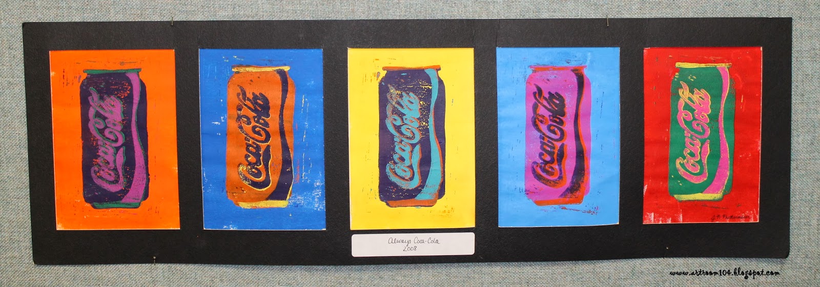
For this project, I am requiring that they have at least four colors/steps in their prints, like my Coca-Cola can.

Another example I did during my student teaching.  I created this and took a photo of every step to create a visual poster with directions.  This particular reduction print had six steps to it.

These are three student samples from my student teaching.  I did this with a printmaking class that had only 3 students.


Here are the close up shots of my visual poster that I had made.  Sorry for the bad photos...it was laminated and didn't photograph very well under the poor lighting at school.
Draw the design on the block, carve out anything that needs to stay white, and make your first print.

Carve out the area around your object...make your second print...


So, basically by the end, you have nothing left on your linoblock!

Currently the Studio classes are working on making their 10 background prints.  Those are due by the end of class today.  Tomorrow, we'll carve out the area around their object and I'll show them how to carefully line up their block with their first print to layer the second on top.  When finished, students will have to submit to me four of their best prints and eventually we will mat them (whether my maternity leave sub is comfortable teaching that or it waits until I return to school...)

Tuesday, October 15, 2013

Styrofoam Statue of Liberty Prints

In my 3rd-6th grade 12:1:1 class, we started out the year by doing sytrofoam prints of the Statue of Liberty, based on the art of Keith Haring.  We spent approximately three class periods creating these.  Due to the nature of this class, it's difficult to do a project that aligns with what they are learning as they are all learning different things.  At the time we started this, the classroom teacher was simply doing a review of New York State until pre-assessments were completed, so I figured these prints would fit in nicely.

On the first day, we looked at my power point about Keith Haring and looked at his screen print of the Statue of Liberty.  Students then had to draw their own version of the Statue (after, of course, we talked about how big she is, what her crown stands for, and other characteristics of the statue).

On the second day, I approved their drawings and let them draw their designs onto a piece of styrofoam with a wooden stick.  We used styrofam that was donated to the classroom (it came in the form of cleaned and sanitized meat trays!).  Students then experimented with making prints.

On the last day, we had mini critiques at each table.  Every student received a chance to lay out all of his or her prints for discussion.  Students talked about color choice and how clear the print turned out.  Once they had their best print picked out, we matted them using pre-cut mats.

I had the students draw a border around their print before cutting to ensure there would be enough paper to tape to the mat (some prints were a bit smaller than the frame opening).  I showed them how to tape it from the back, and then we signed our prints using the artist's name, a title, the edition number and the date.

The students were really proud of these, and considering the multiple ranges of abilities, I'm pretty happy with them as well!


Sorry about the bad coloring on these...they looked fine on my camera when I photographed them, but when I uploaded them, the computer really changed the colors!

The following is the rubric that was used to grade these projects:

Tuesday, September 24, 2013

Studio Art: Unit 2 Begins...2-D Media

My first unit lasted about as long as I had hoped it would, and on Friday we began our second unit.  Our second unit is all about 2-D media...drawing, painting and printmaking.  I am also combining art criticism with this unit.  The textbook I am using has art criticism as its own unit, but there is no way I'm going to spend an entire week or two just on art criticism...that's something we can work on over the school year to perfect, a little at a time.  The students have also been antsy to get started on a "real" art project.

The cover of my unit 2 note packet...stay tuned to the SmARTteacher website...my unit is posted there now!


On Friday, I introduced/reviewed value and the four common shading techniques with the students: hatching, cross-hatching, stippling and blending.  They had to practice in their notes and then for their second sketchbook assignment, I asked them to set up a 3-object still life at home, shine a light on it, and draw it using value.
This is the generic sketchbook assignment rubric I have created for the weekly sketch assignments.  Each student has now seen this and will have their Friday sketch assignments graded according to this rubric every Monday.  So far, I think I'm happy with it...but we'll see if I feel like I need to make any changes to it.

On Monday, we started off the unit by discussing the different drawing media that can be used (oil pastels, pencil, chalk, etc.) and we spoke briefly about art styles.  Again, this is something we will work on throughout the school year, but the projects we do for this unit are all going to fall under the realm of pop art, so I want students to have a basic knowledge of what pop art is compared to the other styles of art.
In the back of my packet, I put colored copies of these paintings.  We cut them out, and then one at a time, we talked about which style they thought these fell under.  Quite a few students new some of the more popular artworks here and knew the styles (although when I had them in 6th grade, they had to do a group research project on an artist...I found it quite wonderful that a lot of them retained the information!).

 Now, as I graded those sketch assignments on Monday, I realized that the students (a) didn't have a good idea of what I meant by set up a still life and (b) didn't know how to properly utilize value with observation skills.  Thus the reason why it's important to give sketch assignments as homework (a good way to assess prior knowledge!).  I threw out my original plans for the next few days and pulled out the mannequins I bought for the elementary room with past SmARTteacher winnings.  I set them up in the middle of the tables, let the students arrange them, turned the lights off and put a spot light on the figures.  I gave a brief demonstration of how they should quickly do a contour drawing of the figures and then demonstrated the proper way to observe value.
The students REALLY enjoyed doing this and asked if we could work on it again tomorrow...heck yes!

I found that they did okay observing the shadows and high lights, but they had a tendency to just give a dark and light value.  I went around to each student and asked if I could show them on their drawing how I wanted them to exaggerate what they saw and make more of a range of values, from black to white and everything in between.  Once they saw how much their drawings started to pop, they were really excited!

Tomorrow, I am going to give each student a large piece of drawing paper and an ebony pencil.  I envision having them do multiple drawings of the figures on one sheet of paper...a super huge close up of a figure that goes from top of the page to bottom...smaller figures that go off the page, etc.  Just a montage of mannequins!
 --------------------------------------------------------------------------------------------

Once we move on from practicing the value (probably by Thursday or Friday this week), students will have to bring in a wrapped food item, such as a candy bar, and do a large, up-close black and white drawing of it.
As we move onto the painting aspect, students will learn about how paint is made and we will then use our candy bars and acrylic paint to do a pop art painting...I'm thinking more in the style of Claes Oldenburg.  I want them to incorporate some acrylic mediums that I bought to give their paintings texture.  This project will be a way for students to utilize the elements and principles to create an interesting composition.

For the final 2-D project, printmaking, students will do some reduction printing ala Andy Warhol.   I did this with my printmaking class when I did my student teaching, and I have my example hanging on a bulletin board in the high school art room that students were admiring and mentioned they wanted to do (I hung up some of my artwork from the past, both high school and college, so that students could see what I am capable of).  So, I'll have students bring in a popular object to turn into a multi-colored print.

This unit will also introduce art criticism to the students.  That was originally what I was going to start with, but I was tired of doing the note thing, and so were the students.  I prefer getting the boring stuff out of the way in the beginning, but I need to remember that the students don't think that way!