Sunday, October 23, 2016

Art History: Ancient Egypt

In Art History, once we finished up with prehistoric art, we moved on to Mesopotamia and then Ancient Egypt.  So far, even though we only meet every other day, we are keeping on track extremely well with my planned out timeline for the school year.  We have three more weeks left for the first quarter and my goal is to cover Ancient Greece by the 10 week marking period.  We just finished with the Minoans and Mycenaean, and will be starting Greece on Tuesday this week.

Here is my student's diorama for Egypt, as well as her essay.  At this point, I will start going through her essays to point out areas that she could elaborate on her ideas, and I plan on teaching her the Chicago style of citations (footnotes and end notes).  For her next essay, I'm going to require her to use citations as well as cite the textbook we are using in her essay.  We will build slowly from there!

         Ancient Egypt is, by far, one of the most impressive cultures in history.  From the sky-high pyramids, to the mummification of their dead, tot he solar religion system, Egypt has obviously amazed archaeologists, historians and even artists for centuries.  The ancient Egyptian style of art is shown through paintings and carvings on the inside of pyramid walls, sculptures created to honor gods and the dead, and the actual structure of their buildings, such as pyramids.  Throughout this unit, I learned all about the culture of Egypt, which helped to further my understanding of the artwork from this time period.  The ancient Egyptians used techniques that differentiate their art from other cultures around this time, such as the canon of proportions--a twisted perspective of the human body, showing a front view of the shoulders and torso, a side view of the head, hips and legs, and identical hands.  Gods and goddesses are shown with human bodies and animal heads in all Egyptian artwork.  What truly amazed me about the Egyptians is their idea of permanence.  Temples and artwork alike were created very strategically and with much thought in order to assure that they would last forever.  This idea is also shown through the mummification of the dead, as a way to prepare their people for a permanent afterlife.  Ancient Egypt has had a great impact on the world of history, religion, and art.

          For my Ancient Egypt project, I I decided to decorate a diorama to look like the inside of a pyramid.  To achieve the ancient pyramid feel, I used spray paint in yellow and red to create a golden look to the pyramid walls on both the inside and outside of my diorama.  Inside, I painted a large depiction of Egyptian artwork on the back wall, with two men and a god shown in a line.  To make this look extremely realistic, I used the cannon of proportions to paint the figures.  Their heads are shown from a side view, although their bodies appear to be from the front view.  The god I painted has a bird mask for a head, as Ancient Egyptian art depicted gods and goddesses with animal heads.  On the two side walls of my pyramid, I painted hieroglyphics as a writing form, but the writing style they sued includes shapes of objects rather than letters.  Symbols I used include the eye, hands, and a turtle. I also created an Egyptian pharaoh in a sarcophagus out of modeling clay, dusted with gold and blue pigments to give it a shiny appearance.  Surrounding the Egyptian sarcophagus are four jars, also made out of clay, which would have been used to hold the mummy's stomach, liver, intestines, and lungs.  These jars are decorated to represent the head of the mummy.  Ancient Egyptian culture has had a major impact on cultures throughout history, and the world.

Monday, October 17, 2016

Visual Journals 5 Weeks: Mind Map

The final visual journal assignment that was due at the five week marking period was called Mind Map.  I asked students to take this right brain / left brain quiz and then illustrate their results. (There is also an app for the iPad for this particular quiz.)  This, of course, required them to do a little research to understand what the right and left parts of the brain did.  This project really stressed a lot of them out.  If they didn't know what it meant to be right brained, they would ask me, and I would tell them, "Go look it up on the iPad." Which would result in a lot of whining. Some days, I literally had to tell them not to ask me any questions, consult the document in Google Classroom, or ask their friends, at least with the 7th graders.  (My 7th graders this year is a pretty needy group...perfectionists...almost feels like they've been hand-fed and they aren't used to doing things on their own anymore...we are slowly breaking down that barrier in the art room!)
  
Now, I know that there are some arguments out there that the right brain / left brain theory is an old one and doesn't apply anymore, but I think there is value to this.  First, I wanted students to have an unbiased idea of how they think.  Most thought they would be left brained, but when they took the quiz THE FIRST TIME, it showed they were more right brained.  (Obviously, they would then take the quiz again and skew their results...so if you do this with your students, only allow them to take the quiz ONCE.)  Many were surprised that they were 50/50.  Some weren't surprised at all that they were mostly left brained.  Once they took the quiz, we were able to talk a bit about what that meant for them in art class.  If they are more left brained and mathematical, I would expect that they may like to draw using grids and rulers...perfectly ok!  I had hoped that by doing this assignment, it would put them more in tune with how they think and what comes more naturally to them so that they could then apply that thinking to their assignments.

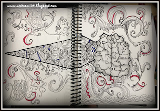
Here is my finished Mind Map assignment.  :)


One of the few students who didn't want to use a brain in their image.


Absolutely loved this one!!!  Though I think she may have skewed her results because she definitely has more right brain in her than she thinks she does!


One of my Drawing & Painting students.  Absolutely love her take on this assignment!  She's the only one who actually used a head!

Drawing & Painting student with an AMAZING line drawing!


7th grader...the same with the fabulous graffiti name from the previous post.


Now, again, many of these weren't horribly interesting with design, using mixed media, or brimming with creativity, but they were a great place for us to start having a conversation as a class and to work on critiquing ourselves and others.  Later this week, it's my goal to have students upload these to Artsonia using classroom mode and answer a few questions to write their artist statements, and then look at what the students created from the other classes.  Round one of visual journal assignments is OVER!


Visual Journals 5 Weeks: Name Design (Picture HEAVY Post)

Here is assignment #2 from the first batch of visual journals assignments due at the five week marking period.  The second assignment was a name design on the inside front cover and first page (that two-page spread requirement).  Like the cover, it was supposed to be mixed media, and the only other requirement was that the student had to somehow show themselves in the design (like a self-portrait...but it didn't have to be an actual picture or drawing of themselves).  Here is a variety of the student designs!

On many of these, I did blur out names so that first and last names weren't showing.  If you come across an image that looks weird and blurred in unexpected places, that is why. ;)

The student's last name, which is blurred out, really balanced this out well...blurring his name doesn't do it justice!


Collaged background with acrylic name.


An amazing 7th grader I have!  He has always admired the graffiti art when we do it as an elementary student...needless to say he is really excited to get to the graffiti unit!


This student used the acrylic spray paint I have, oil pastel, and then used some really cool fabric tape to make his name!


Acrylic paint...not mixed media, but this girl has amazing craftsmanship with paint!

Again, many students missed the boat with the mixed media aspect of this, but I know they are going to improve.  We have some pretty solid designs in terms of composition, we just need to work on experimenting and being opening to making mistakes and learning how to fix them.  You can see my name design (and cover design) on the first informational post I did about these assignments, with my rubric, here.

Visual Journals 5 Weeks: Cover Design (Picture HEAVY Post)

Time to dive into those visual journal assignments I was talking about a while back.  I am giving visual journal assignments to my Studio Art, Art 7, and Drawing & Painting classes.  (You can read with more detail the idea behind these, as well as check out the rubric I am currently using to grade them here.)  Basically, every five weeks, each class has a total of 3 assignments that are due to me.  I will not accept them late (they do receive automatic 0's if they are not handed in by the deadline).  Students in each class have the deadlines and the assignments for the entire school year all mapped out in a document available to them on the Google Classroom, so there are no excuses.  Plus, I have made Fridays "Visual Journal Friday", giving students the opportunity to work on these in class with the materials available.

Aside from the vague description given for each journal assignment, students must use mixed media and their assignments must be a two page spread.  I have my two studio art classes' assignments due on the Friday before the end of each marking period, and then I have the Art 7 and Drawing & Painting students' assignments due on the last Friday of each marking period (though I post that they are due on Thursday instead, just to give a little wiggle room).  These assignments are meant to be open-ended, allowing students to think creatively, problem solve, and experiment...basically many of the ideas from Choice Based Learning or TAB programs.

The first three assignments were a cover design, a name design on the inside cover (that somehow had to have a self-portrait of the student...and by that, I meant not a selfie, and not necessarily a drawing of their face), and something called Mind Map.  More on those in the next two posts.

Here are a whole bunch of the cover designs.  The covers were challenging because my students had two different types of sketchbooks...the black, hard cover ones and then spiral bound.  The black ones are notorious for becoming unglued at the binding, but unfortunately, all of the sketchbooks I ordered never came in and I had to fall back on the stash I had stocked up on in previous years.  (Yes, I supply sketchbooks to my students.  If I don't, they bring in Dollar Store sketchbooks that don't have enough pages and fall apart within weeks.)  Depending on the cover and depending on what they chose to do, some students had to gesso the covers, some glued drawing paper on so they had a surface to draw on, many painted, and some collaged materials together using acrylic gloss or matte medium.

Underneath each image, I'll give a brief description of what the student did to achieve their cover. :)

This student glued down some drawing paper, drew the geometric forms with pencil, and then use acrylic paint over the top paint negative space, creating his initials.

Acrylic gloss, newspaper, and tissue paper.  Then the student used washi tape to write "Art" and also dripped colored India ink onto her collage, blowing it with a straw.

Marker on drawing paper to get the black lines, and then she collaged tissue paper over the top with acrylic gloss.

More acrylic gloss and tissue paper.  A bit of glitter too.

Duct tape, green masking tape, and marker.

Tissue paper, acrylic gloss, and painters markers.

Newspaper, tissue paper, and letter stickers.

This student masked off the front cover with tiny strips of masking tape to paint the galaxy diamond with acrylic.  Then, the back cover, she mimicked the galaxy.

Acrylic paint...she used masking tape to mask off the chevron, and then painted the anchor and words.

Masking tape and marker.

Collage over the top of an acrylic background.

This student had an amazing marker design drawn out and taped to her cover.  She then took magazine clippings and taped them over the top.  Unfortunately, I think she went a bit overboard because she covered up her marker design a bit too much, but either way, it's still interesting to look at!

Baseball fan...obviously...tempera and Sharpie.

Gesso background, masked off trees / drawn stencil used for deer head, and then splattered painted with acrylic.

Spray paint, acrylic, oil pastel...

Spray paint and masking tape used to mask off the letters.

Another spray paint with masked off letters.  Also used oil pastels to write his name and "journal".

These two covers came from my Drawing & Painting class.  I guess I didn't make it very clear to them that it had to be front and back for their cover designs, so for this assignment, I let them do just the front cover.  On the left, she collaged together magazine clippings, and on the right, she did scrapbook paper and then created a dress for a croquis using tissue paper.  The girl on the right is also in my Fashion Design class, and since posting this, she has added to her cover to make it more mixed media.

A student who went overboard with the acrylic paint and texture rollers (the paint is super thick!!!), but ended up with a really cool feeling visual journal!

Another Drawing & Painting student...chalk, collage, marker...

Acrylic background and washi tape words.

One of my few Drawing & Painting students who did the front and back.  She laid down acrylic string gel for texture, painted with acrylic paint, and then splattered the white.  I believe she plans on doing more with this but ran out of time before the deadline.

Another Drawing & Painting student.  His design is really quite awesome.  He was trying to show how ideas look on paper versus how ideas look in his head.  We went round and round with each because I felt like he should have outlined the paper and books to make them stand out more.  Originally, it looked unfinished when he handed it in, especially with the beautiful bubble at the top.  It's hard to see from this picture, but he went back in and added pencil shading to the brain in order to connect the pencil book to the brain.

So, as you can probably tell from these, quite a few students didn't understand the concept of mixed media, nor did they seem to put a huge amount of effort in, but I can tell you that I am EXTREMELY happy with these!  Even the ones with seemingly little effort are more effort than sketchbook assignments from previous years.  The students are really enjoying these, they like that I give them Friday's in class, and with our next set due the first week of November, I've already seen some amazing ideas on paper!  Students were definitely having a hard time with the first batch of assignments because they were worried they would mess up, do something wrong, or it wouldn't be up to my expectations.  However, I think they are getting more comfortable already and feeling a bit more creative!