Wednesday, September 4, 2013

No-No Board and the Colored Pencil Test

A while back I did a post comparing Prang markers to RoseArt...today's post will compare Prang colored pencils to Crayola's.

Yesterday was our first staff development day, and luckily our administration gave us quite a bit of time to work in our classrooms, which was a relief because I still have a lot to do!  Luckily, I crossed off quite a bit on my checklist (only to find that there was more stuff to do that I overlooked...go figure!), including putting away the remaining supplies in the high school room, cleaning out the last supply cabinet that I hadn't touched yet, and finishing up my No-No Board in my elementary room.

The night before, I pulled out the colored pencils to finish making the pictures for my board.  In case you haven't seen a No-No Board before, I just want to say that the idea is not mine...I found the idea over at Mr. E's blog.  Now, I've noticed there tends to be a bit of a debate whenever one of these shows up in a teachers classroom, but I think it will complement my craftsmanship rubric pretty well.  (Phyl did a post a while back about the controversial No-No Board as well...)

I concentrate in all grades on these drawing ideas ("Y" trees, using a horizon line, etc.).  Don't get me wrong, this is not here to squelch creativity, but particularly with the older students, they should be moving past these drawing cliches.  Unless a project or assignment calls for these "stereotypes" (like cartooning...it's okay to have words in your art!), I'd be more impressed if students were more creative and more mature in their depictions, which is what I aim for.  If you check out my craftsmanship rubric, you'll notice that the things on the No-No board correspond with the craftsmanship rubric descriptors.

Ok, enough of that...onto the colored pencils!

The first thing you'll be likely to notice is that the Prang pencils are thicker and more of a triangular shape...


Next are the colors.  Crayola has two greens, red-orange and a white, compared to the Prang which has a magenta, gold and silver.  I think you get a broader range of colors with the Prang, which is nice, especially with having the gold and silver...not having a white is the only drawback, especially if you like to do projects on dark paper.

Just for fun, I decided to pull out some of my own personal colored pencils, which also happen to be by Prang!  I bought these colored pencils years ago at an Office Max and I can't find them anymore, so I wanted to see how similar the Prang colored pencils were that I got in the mail.
The only colored pencil I'm missing from my personal ones is a black...I used that sucker till it was gone!  At the bottom of the page I did a quick value scale, Prang on top, Crayola on bottom.

Finally, I decided to see how the colored pencils would blend together.  Crayola -is on the left, Prang on the right.

 So, here are my findings:

Crayola
-thinner pencil & lead = easier to break
-thin pencils are harder for small hands to control
+thin pencils fit into most pencil sharpeners
-does not come with a pencil sharpener
-harder lead makes for harder blending
+comes with a white
$2.59 at Office Depot
$1.95 at Walmart (though current school sale puts them at 97 cents)

Prang
+thicker pencil and lead = sturdier
+thick pencils make it easier for younger students to hold and control
-thicker pencils that don't fit into all pencil sharpeners
+comes with a pencil sharpener in the package
+medium lead makes for easier blending
+comes with gold and silver
$1.96 at Walmart
$1.97 at Amazon.com

My Personal Prang Ticonderogas
+thin pencils with a thicker lead (fit into pencil sharpeners, less chance of breakage)
+soft lead makes for excellent blending (no streaky coloring!)

All in all, I'd say the Prang colored pencils are a pretty good deal.  Crayola is a good one to go with if you catch them on sale, but otherwise the price is comparable.  Once I go through the stock-pile of colored pencils I currently have in the next year or so, I may consider purchasing some of these Prangs for my younger elementary kids.  Now, if I could find the Prang Ticonderogas at a decent price, I'd definitely buy them for my high school students!  This year I am trying out Sarget colored pencils with them...


Saturday, August 31, 2013

7th Grade Graffiti Overview


So here is the unit I plan to start with in Art 7, once we've finished our pre-assessments, of course.  Last year, these students, as 6th graders, asked to do a graffiti unit, but we ran out of time.  When I met with the upcoming 7th graders at the end of the school year, I asked for input on what they wanted to learn about in Art 7, and the first thing that topped their list was graffiti.  I've talked a bit about this graffiti unit in previous posts very briefly; mostly about how I knew very little about this art style and movement!

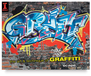
GRAFF The Art & Technique of GraffitiI've utilized this book by Scape Martinez to build the unit.  I ordered it from Dick Blick.  It has a nice, brief overview of the history of American Graff writing, or graffiti, and has really great directions and pictures of how to create your own individual tag.  I ordered the Graff Color Workbook as well, which contains a lot of the same information, but also has some great drawing and design prompts, which I will probably use during the school year for sub plans and bell ringers.  I've gotten a lot of information  and ideas from the book alone that I haven't really dived into the workbook that much yet!
Unit Introduction:

As with any unit plan, Marzano believes that you should always have a good introduction to the unit and I second that!  The introduction is used as a way to introduce a new topic to students, as well as find out what they may already know about that topic.  An introduction lesson does not have to be a full class period...in college we were encouraged to make the introduction lesson 15-20 minutes in length.

For my intro. to graffiti, we will begin with a discussion about graffiti as art versus vandalism.  It will be interesting to see how this discussion goes, especially since I live in a very rural area where a majority of the graffiti that is seen is on the side of the trains!  This discussion will also give us a chance to talk a bit about how to participate in graffiti legally!  I'll round out the end of the class with some YouTube videos about graffiti and an appropriate exit slip question.

Lesson 1:  History of Graffiti
It only seems fitting that for the first lesson of this graffiti unit, students learn about the history of graffiti.  This would be part of what Marzano calls the "acquiring and integrating" aspect of a unit.  Students will learn about some famous graffiti artists, including Taki 183 (who is credited with starting the tag idea), Keith Haring (who combined his graphics art training with subway art), Bansky (who is an anonymous contemporary graffiti artist), and Scape Martinez (the author of the Graff books).  Easy way to incorporate the Common Core ELA Shifts when students are asked to read brief news articles and biographies about each artist.

 Lesson 2: What is a tag?
The second unit will involve learning about the importance of a tag in graffiti.  Graffiti art revolves all around an artist's tag.  This acquiring and integrating lesson will be less about note-taking and more about brainstorming individual tag ideas.  The following is included in the student's note packet and is a summary of information taken directly from the Graff book:

When choosing a tag, think of the following:
1.      How does it sound?
a.       What does it make you think of?
b.       REVOK vs. SLICK
2.      How does it look when it’s written?
a.       How do the letters look when written together?
b.       Is there rhythm to the way your letters look?
3.      Length
a.       Don’t make your name too big
b.       Short and to the point
c.       Ideally, no more than 6 letters
4.      What does your name mean?
a.       Sometimes it doesn’t mean anything, just sounds cool
b.       Some names stand for a hidden meaning
5.      Numbers?
a.       Early artist’s incorporated numbers, which stood for the street number they lived on…i.e. 125th street in NYC = SCAPE 125
b.       Numbers can be used for purely a design element…i.e. MODE 2
6.      Some other tips:
a.       Double A’s and E’s promote balance
b.       Q, X and Z are letters that are often difficult to work with
c.       Be creative with spelling
                                                               i.      Interchangeable letters (C and K)
                                                             ii.      ESCAPE became SKAPE, which was finalized to SCAPE
Here's where a homework assignment comes into play.  Students will need to brainstorm tag names for themselves.  I expect at least five ideas.  The bell ringer for the next class will be to get into groups and discuss each other's ideas.

  Lesson 3: Elements and Principles of Graffiti?
The final acquiring and integrating lesson will talk about the design aspects of graffiti.  We will review the elements and principles, as well as the more specific graffiti design vocabulary mentioned in the Graff book.  According to Martinez, tags can be broken up into four elements: letter text, arrows, flourishes and symbols.  We will review what each of these elements are and students will have to draw a picture in their notes for reference.

This is also where we will get into the different styles of graffiti: Bubble letters, block letters, semi-wildstyle, wildstyle and 3-D wildstyle.  Again, I'll ask students to write down a definition and draw their tag using each style in their notes.

The final aspect of any good unit, according to Marzano, is the extending and refining portion.  This is where students should take what they have learned, apply it and "refine" their understanding of the information through its use.  All along in this unit, students will be asked to complete homework assignments in their sketchbook to design their tag.  The extending and refining portion will happen when they have to make their final tag design on the cover of their sketchbook (rubric for this is still in the works).  They will also have to take a final assessment in the form of a quiz, where they will be expected to recall vocabulary definitions and draw examples for certain vocab words.

I know there's A LOT of information in this post that doesn't necessarily relate to art and graffiti (ahem, Marzano?). I feel like I am very lucky that my school chose Marzano over the Danielson Framework for our APPR because in my art education courses at St. Lawrence University, the textbook of choice was Marzano's A Different Kind of Classroom, so I have a bit of a heads up on this whole Marzano thing compared to other teachers in my district.  I am not very familiar with the Danielson Framework, but hopefully there is a cross-over in some of this information that can be found useful for those who have to use Danielson!

26 Weeks and counting!

As probably one of the last blogging art teachers to start school up, I'm sitting in the recliner right now, enjoying my last weekend of freedom...in the damp, humid summer-like weather that NY is experiencing right now!  Can I just say (and I'm sure other Northern New Yorkers would hate me for saying this right now...but) that this pregnant lady is ready for the cold weather???  Bring on the snow!
Last week's bump photo...as of this last Friday, I'm currently 27 weeks!

Onto more lesson planning...Staff development for me is this Tuesday and Wednesday...kiddos come back Thursday.  Soon to follow: an overview of my 7th grade graffiti unit!