Monday, September 29, 2014

1st Grade Crazy Pumpkins, Part 1

Once again, I'm changing it up this year for 1st grade.  This year's group of kinders and 1st graders are a bit lower developmentally and behaviorally than in the past, so I have to start a bit simpler this year.  For our first project in 1st grade, we are reviewing basic color theory (primary and secondary colors) as well as talking about what a landscape is.  To tie it into the fall season, we are incorporating pumpkins!

This project has turned into a three day project.  It probably could have been squeezed into two, but the students were actually taking their time to cut and glue the pieces that I didn't want to rush them!  Here is what we did in the first two days.

On day one, we reviewed the primary and secondary colors.  They learned this in the beginning of kindergarten last year and periodically reviewed it through the year.  Each student received three pieces of Manila tag board and wrote their names on the back.  I held up yellow and blue paint, asked the students to share at their tables what color they thought those would make when mixed, and then went around to each student and put a squirt of each color on their paper.

The students then had to mix the paint on their paper while painting the entire thing.  This was also a great review right out of the gate on how to paint properly with tempera paint...no banging the brushes on the side of the water container (wipe on a tissue or paper towel), periodically dip your brush in water to help make the paint spread easier on the paper, etc. etc.  We repeated this until we had painted an orange, purple and green paper.
Purple is always a hard color to mix.  I found that when the students used the fluorescent blue and red, the purple was really pink, which you can see in the pictures below.  With another class, I gave the fluorescent red and regular blue tempera and the purple turned out darker, like my purple in the picture above.

On the second day, I demonstrated how to cut thin, tall rectangles out of the green paper to make grass.  I had students glue a row of grass onto the purple paper.  Next, I asked them to cut out a small, medium and large pumpkin out of the orange paper.  We discussed a little bit about how pumpkins can be different shapes...not always perfect circles...to ease their minds about not being able to cut a perfect circle.  We glued these on next.  (If I had more time with the students and had thought about it sooner, I would have incorporated the book, Spookley the Square Pumpkin...it's a super cute book and there is even a cute, video version of the book.)

Lastly, I asked students to cut out more grass and I showed them how to put grass on top of the pumpkins and behind them to make it look like the pumpkins are sitting in tall grass.

I don't usually start the first project of the year in 1st grade with paint, but I must say that I am extremely happy with the results so far.  This project doesn't require detailed painting so it's a great way to review how to paint with tempera from last year (no banging brushes, swish to rinse, no bad hair days, etc.).  It's also an awesome review for scissor safety and for using dots of glue instead of globs. :)

Lots of students asked to be able to put eyes and a mouth on their pumpkins.  Since 99% of the school population in my district does participate in Halloween events, I can and will allow it.  I won't require it however, in case someone doesn't celebrate Halloween or simply does not want to add eyes and a mouth.  I even had a student ask if he could make the eyes on his pumpkin yellow so that it looked like a glowing jack-o-lantern!

Sunday, September 21, 2014

Bell Ringers in Studio Art

Last year I really struggled with making the sketchbook a meaningful learning tool in my high school classroom.  Granted, I had quite a few obstacles in my way, including maternity leave and sick time leave for my husband's chemo treatments, however after I was back from all of that, I had the hardest time getting back into using the sketchbook.

I attended a staff development at the end of the year last year that was put on by our Boces.  About 10 art teachers from our county got together and just spent a day brainstorming ideas, discussing APPR, pre- and post-assessments, and basically venting.  It was great!  One of the middle school art teachers from another district shared how he uses bell ringers every day to introduce students to art history.  He uses the first 5 minutes of class every day to introduce, review and expand upon a famous artist from history, spending 1-2 weeks on an artist.

Another high school teacher shared how she calls her sketchbooks "source books" instead of sketchbooks.  She doesn't assign sketchbook assignments on a weekly basis because the students would never do them.  Instead, the source book is used as a place to plan and practice before starting and finishing a final project...(duh!  Isn't that what we teach students the sketchbooks should be used for???)  She had students who completed miniature versions of a large scale project, done perfectly, in oil pastel or colored pencil.  The students then made notes in the margins about their experience with the medium, how the practice product turned out, what they might change or do differently on the final project, and much more.  I thought it was a really cool way to make the sketchbook more of a meaningful tool.

When I stepped away from that professional development meeting, I had tons of new ideas.  I used the summer to figure out how I was going to use those techniques to fit my teaching style, my students, and my classroom.  Bring on the bell ringers!

Because we are using Marzano, bell ringers are one of the big things that the administrators are looking to us to use to show that we are constantly assessing our student's understanding of the material we are teaching. Since I am also an art history major, I decided to use my bell ringers to teach students about famous artists in history and the various art styles (non-representational, abstract, impressionism, realism, etc.).  Last year, I tried to incorporate the styles into my second unit and I failed miserably at teaching the students those concepts.  They did not know them very well at the end of the year and could not describe the styles very well.

So far we have had two complete weeks of school.  I used the first week to introduce Mondrian in bell ringers.  The second week was used to review all of the art concepts we talked about in the unit 1 note packet.  Next week, I will introduce the next artist, which I am planning on being Miro.  The great thing about these bell ringers is that it's a sneaky way to incorporate writing...ahem, common core, ahem...without the students being too suspicious about it!  Once I introduce Miro, we will compare the two artists and their styles, via bell ringers, to discuss why abstract/surrealism is different from non-representational art.


We did 5 day so of bell ringers for Mondrian.  Here is what we did and the order that we did them:
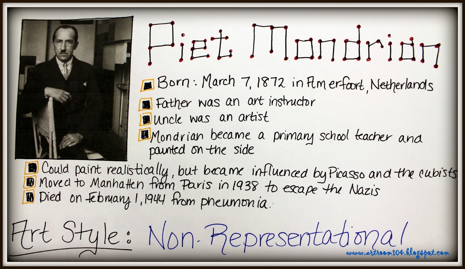
1. On the first day, I had some biographical information on the board for students to copy down.  They also had to paste in a picture of Mondrian as well as "Broadway Boogie Woogie" and its credit line. (This one took about 10 minutes.)
2. On the second day, students inserted "Composition A" and "Self-Portrait".  I gave them both to show them that Mondrian could actually paint quite realistically if he chose to. (5 minutes)
3. On the third day, I asked students to make a list of the characteristics of Mondrian's famous work ("Broadway" and "Composition A"). (5 minutes)
4. On the fourth day, students were asked to compare two paintings I gave them.  They had to tell me which one was a Mondrian and why. (5 minutes)
5. On the fifth day, I asked students to do a quick, 2-minute drawing on their page of a Mondrian inspired design. (5 minutes)


Some students managed to fit everything on one page and those who had smaller sketchbooks did them on two pages.  What I love about this is that they now have a little study guide / note page for a single artist.  

Now that we have done this once, I'm hoping that it will take less time to get them to complete the rest.  The biographical day of bell ringers will probably always take more time, which is ok.  Now, I really just need to hammer into their heads that they actually need to look on the board and do the bell ringer on their own every day...I shouldn't have to remind them!

Friday, September 19, 2014

Studio Art: Unit 1, What is Art?

Over the summer, I did manage to do a little revamping to my Studio Art units.  Last year I had them categorized as the following:
Unit 1: What is art?
Unit 2: 2-D Art
Unit 3: 3-D Art
Unit 4: Ceramics
Unit 5: Zentangles

This year, I have shortened the units in order to break up the information a little more.  I have also rearranged a few of my projects.  This is what my unit order will look like this year:
Unit 1: What is art?
Unit 2: 2-D Art: Drawing
Unit 3: 2-D Art: Painting
Unit 4: 2-D Art: Printmaking
Unit 5: 3-D Art: Sculpture
Unit 6: 3-D Art: Ceramics


This post is basically a quick recap of what we have accomplished for the first unit in the first two full weeks of school.  Much of my original unit is still the same...I use the Art Talk text book (ugh!) to do the first half of the note packet, which is about why artists create art (to be functional, for express oneself, for religious purposes, etc.) and where artists find inspiration from (the person paying them, their culture, world events, past artists, art media and styles, etc.).  Once this was accomplished, I assigned a sketchbook assignment for the weekend.  A fellow art teacher in my county suggested this book at one of our last staff developments.  It has some awesome ideas!  

Unfortunately, this was assigned after two days of school...a time period when a lot of students didn't have their sketchbooks yet (even though it was on their supply list...sigh).  Quite a few were completed on lined paper or computer paper and have already been lost. :(  Here are two though...sorry for the bad pictures!
Mine is the unfinished one on top. :(  The weekend I gave this assignment, my mom's dog was hit by a car and I wasn't thinking...I ran out to the road to scoop her up and she bit me.  I was out of commission from being able to really do any drawing or typing for about a week until it started to heal up.

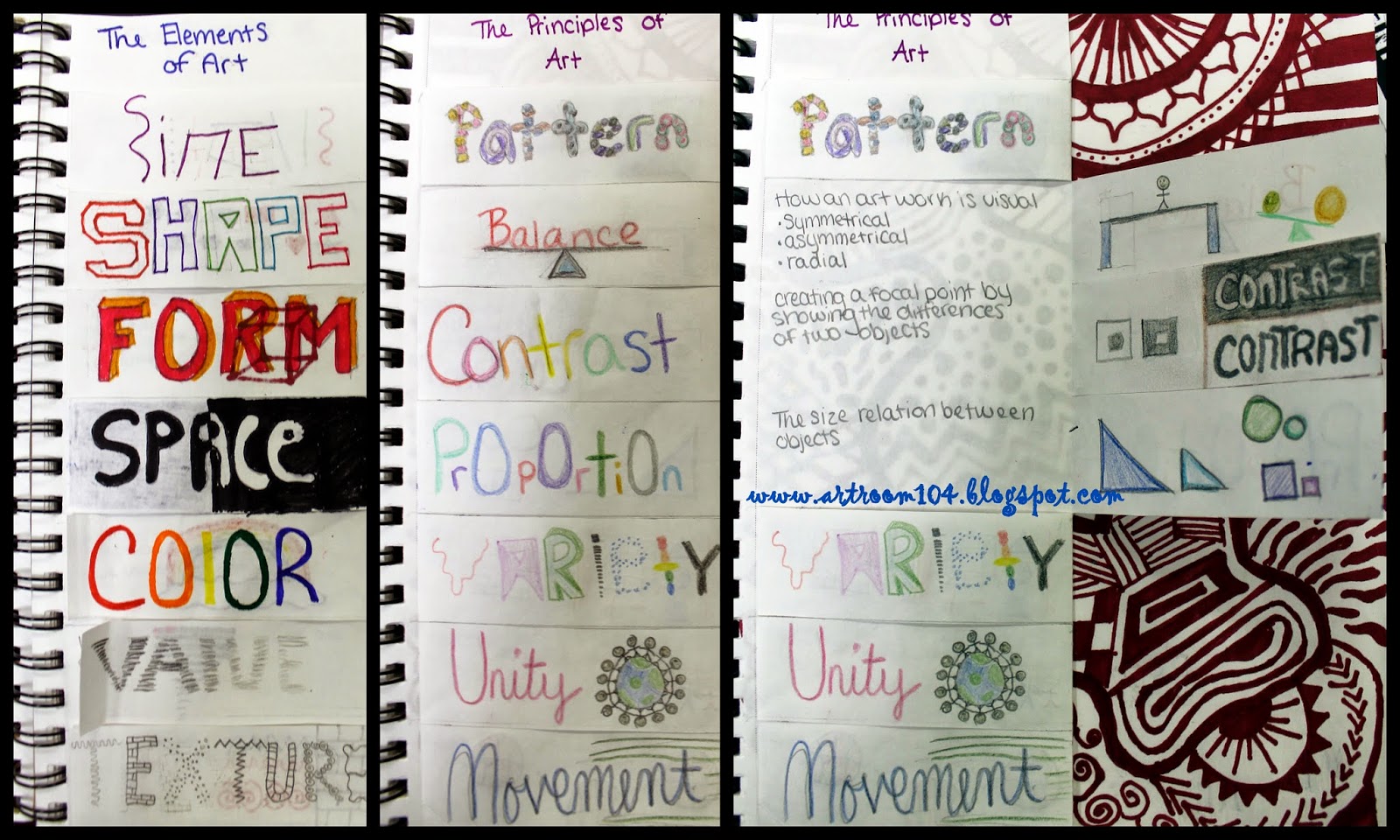
For the last week and a half, the students have been working on infographics...one for the elements and one for the principles.  I am really trying hard to use sketchbooks EVERY DAY in Studio Art.  Last year I dwindled off on assignments in them and it was virtually pointless to ask students to use them.  (Stay tuned for future posts about how I am using sketchbooks every day!)  If you've been following me for a while, you'll remember the elements of art infographic I had students do last year.  They did these on a separate piece of drawing paper and eventually lost them of threw them out.

This year, I required the students to build them right into their sketchbooks so that they would always have them!  I also required them to make one for the principles of art.  Last year my students did not know these and when we tried to do critiques, it was very difficult to talk about the art.  Here are a few examples, including my own!
My examples of the two infographics.


The second sketch assignment I had students do was a non-representational line design.  This was assigned after their introduction to the elements and principles infographic project.  Again, this is a repeat assignment from last year.  Students were asked to use only one color and line to create an interesting design.  Some students strayed outside the project parameters and used more than one color, but in all honesty, their designs ended up being more successful than some of the single colored ones, so I didn't dock them on the rubric.  This sketch assignment then opened the door for the final project of the unit...zentangled master's paintings!

 I use a standard rubric for sketch assignments that is worth 16 points.  Students are assessed on following assignment criteria, using the elements and principles, creativity/originality, and craftsmanship.  I try to write a comment on all rubrics before passing them back...another one of those things I can check off my Marzano checklist!

The zentangled paintings is something I did last year at the end of the year, sort of as a wrap up.  I decided that this project was an awesome way to reiterate the elements and principles so I moved it!  I expect that it will take the students about a week and perhaps a few days to complete these drawings, making unit 1 a total of about three weeks.  We started off the zentangles by making one 3 1/2" tile during a single class.  I always find it amazing that the students who rush everything else complain when you tell them that this should take less than 20 minutes!


Check back again this weekend and I'll share how I'm using sketchbooks to perform bell ringers EVERY DAY!  Also, if I have time, I'll delve into some Common Core unit plan writing that my district is enforcing this year to replace our lesson plans.  It's a good thing, and a pain in the butt thing all at the same time...  Give me another week and I will be able to start sharing some finished elementary projects too!

Wednesday, September 10, 2014

What's New in My Elementary Room!

Well, this organizational technique isn't exactly new...but I wanted to share.  This is how anal I am about organization at school...I wish I could be this organized at home!  Every year when I unpack my supplies, all of the paint and glaze gets the date written on the cap and I always rotate stock.  I also must have everything organized in the color of the rainbow!  I did a little moving of supplies and finally got all of my paint off of the exterior wall of my room.  There has been so much paint that has been ruined from the extreme cold temperatures that happen at those walls.  When I moved into the classroom four years ago, I threw out TONS of paint that was really old, had separated or became super chunky and smelly from getting really cold.

Next comes my supply bin storage.  In the past, the bins were placed in one spot and the crayons bins were stacked in another.  In an effort to try and teach the students better organization, I have placed a colored dot on the counter where their supply bin AND crayon box must go.  I'm hoping that they will start to be more mindful of keeping the pencils in the pencil box, keeping the glue together and not mixed in with the scissors...we shall see how this goes!

Once again, I have the "New Pencil Jar", where students can get new pencils when theirs become very small or broken in their supply bins.  They put the bad pencil in the red jar and take a new pencil from the green jar.  My Sharpies, which I posted about in the previous post, are located on the table, as well as a box of replacement glue sticks.  
The bottom two pictures show the new supply bin set-up on my counter.  In between the warm colored bins and the cool colored bins is a paper shelf with the colored construction paper and white drawing paper.

This is a new classroom management idea I found on Pinterest.  I found this awesome velcro board at Biglots for $3.  I wrote down my five most commonly abused classroom rules and/or procedures, and made some green, yellow and red faces.  I laminated them all and velcroed them to the board.  Most teachers in our district use the red, yellow, green stoplight idea for discipline, so I'm hoping this will work well, especially for the younger kids.  I have this on my door facing the hallway so that their teacher can see how they did as they come to pick them up.

This is also a new classroom  management technique I am going to try and use for the younger grade levels.  Again, this is another Pinterest steal.  What's great is that this correlates really well with the smiley faces on the door!

Last but not least is my "Art Applause" box.  I wanted to come up with a way for students, faculty, administration and community members to give the students positive praise for their artwork.  This is a great way for the kids to be "bucket fillers", if you know what that is.  It's also a creative way to encourage positive reinforcement and should gain me some points on the Marzano rubric for my APPR! ;)  I have some blank slips left out on the table with a pen.  I will encourage everyone to write a nice message to an artist whose artwork is displayed and drop it in the box.  Every week I plan to empty the box.  I may staple some of the nice comments on the bulletin board with the artwork.  Every student will eventually get their comment to take home.


What's New in My High School Art Room!

So, here I am, half way through the first full week of school.  We started school officially last Thursday.  I haven't finished posting about summer projects, but I wanted to share the new layouts and some new classroom management/organizational techniques I'm using this year.

First is my insanely awesome Facebook bulletin board.  This is actually in the hall way near our cafeteria where everyone can see (high school, elementary, and community memebers).  I am SO proud of this one...and it took forever to choose which Facebook layout to use!  Luckily, I have some really big sheets of white paper that fit perfectly and only need a little bit of cutting so this should be easy to change throughout the school year.   Currently, Van  Gogh is the first artist.  I think the next one will be Mondrian as my Studio Students are learning about him through their bell ringers (which I will post about soon!) and my younger students will learn about Mondrian with the primary colors.

Under the sponsored section, I looked up an old add from the late 1800's and added an excerpt from the book Secret Lives of Great Artists by Elizabeth Lunday.  (I am in love with this book for my high school students!  Great way to get in more reading that isn't super boring!)  I used Picassa to edit and create the photo collages of Van Gogh, his artwork, and his "friends".  

 No onto my high school classroom.  I picked this bins up at my local Big Lots to use as bins for collection and passing back of sketchbooks and projects.  They are bigger than the standard 8 1/2" x 11" paper bins I used last year, which means they will hold all of their different sizes of sketchbooks easily.

I got a new kiln for my high school room!  Well, not really.  The kiln that was in there before was very small...I usually had to fire my high school projects in two firings per project, unlike my elementary kiln that is huge in comparison.  This kiln was purchased about 10 years ago through a grant and has been sitting in storage.  With the gloomy budget we have, they finally decided to give me the new one and sell the old one.  I'm just excited to have a larger kiln!  I also got a new drying rack at the end of the year for the high school room.  The old rack would fall apart every time you tried to lift a shelf.  When purchasing a drying rack, I strongly suggest getting one with springs!

 After last year, students left some projects behind so I can finally decorate this room and make it a little more my own.

I needed to try and figure out how to incorporate the Marzano "I Can..." scale into my high school room.  This is the best way I came up with.  I took those same Mona Lisa faces I use at the elementary end and added some descriptions to them.  These descriptions correspond with my rubrics, which are also 4, 3, 2, 1, and 0.  I figure I can incorporate this scale into my bell ringers/exit slips very easily.

 Ah!  Sharpie organization!  Last year I, ahem, "lost" a lot of Sharpies from the high school room as well as the elementary room.  The top picture shows my new storage idea for elementary.  My lovely hubby drilled 24 holes into a scrap block of wood.  I painted it black, added the color rings around each hole for my tables, and then also added a corresponding colored dot to the cap and marker.  Now, when we use Sharpies, instead of taking them from the box and hoping they all return, each table has their own set of Sharpies that will be easier to keep track of.
The bottom picture is my Sharpie storage in the high school room.  No colored tables there so I added stickers with my room number.  The first block as the fine tip markers (24 of them) and the second block as 12 ultra fine tip and 12 extra fine tip markers.  So far, it's been really easy to make sure I get them all back!  I plan on having him drill me one more block for my X-acto knife storage.

My next post will be about some changes and additions to the elementary room.  I have to say I am SO EXCITED for this school year!  So far, my high school classes are awesome!  All of the students actually want to be there which is great!  My elective, which is officially Sculpture this year, has a total of 14 students in it, which is double the amount from last year. :)