Sunday, October 27, 2013

Upper Level: Personal Art Criticism Worksheet

In my planning for next week, I had a moment of inspiration hit me.  As part of my 2-D media unit in Studio Art, one of the things I introduced students to were the art criticism steps.  We haven't really dived much into them as I plan diving into it more and more as the year progresses.  So far, we've taken the notes on it, done a full art criticism write-up together as a class about "Triple Self-Portrait" by Norman Rockwell, and we've done a bell ringer about it (they had to write a description about one of Monet's waterlily paintings) in their sketchbook.  Other than that, I have really kind of neglected the subject.  In lieu of that it came to me that maybe I should create an art criticism worksheet for them to fill out at the end of every project.  This will help reiterate the four art criticism steps AND they will be reflecting on their own artwork and how it fits the project objectives (hello Marzano!).  Oh yeah, and the writing aspect never hurts either (ahem, Common Core?).


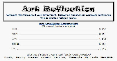
So here is what this sheet is comprised of.  As usual, you can head over to the SmARTteacher website and download the file to use.

Art Criticism: Description
Write a credit line for your artwork:
Title: ___________________________________________________________________ (1 pt.)
Artist: __________________________________________________________________ (1 pt.)
Date: ___________________________________________________________________ (1 pt.)
Medium: ________________________________________________________________ (1 pt.)
Size: ____________________________________________________________________ (1 pt.)

What type of medium is your artwork (1 pt.)? (Circle the medium)

Drawing      Painting      Sculpture      Ceramics     Printmaking     Photography     Digital Media     Mixed Media


Art Criticism:  Analysis
Check the elements and principles you used in your artwork.  Describe where you used them. (10 pts.)
In this section, I have a checklist of the elements and principles for students to choose from.  They must check off which ones they used and explain how and where they used them.

Art Criticism: Interpretation
1.    What is the subject matter of your artwork? _____________________________________________ (1 pt.)
2.    What is the subject genre of your artwork (1 pt.)?  (Circle the genre)
Portrait       Landscape (Nature)      Still Life    History (Religious, cultural, etc.)     Genre (everyday life)
3.    Is your artwork based on the art of a famous artist?  ____________________________________ (1 pt.)
4.    What art style is your artwork created in? ______________________________________________ (1 pt.)
Is there any symbolism in your artwork?  (5 pts.) 
What is your artwork about? (5 pts.)
How does your artwork reflect the learning objectives given to you on the project rubric? (5 pts.)

Art Criticism: Reflection & Judgment

What are two (2) things you think you did really well on this project and why?  (5 pts.)
What is one (1) thing you’d like to improve/change about your artwork? How would you change it? (5 pts.)
Did you like this project assignment?  Why or why not?  (5 pts.) 

0…no experience  ~  3…somewhat confident  ~  5…could teach someone else
Experience level with this medium before project:                             0        1        2        3        4        5
Familiarity with subject/art style before project:                               0        1        2        3        4        5
How comfortable do you feel with this medium after the project?                 0        1        2        3        4          5
How familiar do you feel with the art subject/style after the project?    0        1        2        3        4        5

The last part where students need to rate themselves out of 5 is a really great way to incorporate that Marzano scale I use in the elementary.  Even in the high school end we are supposed to be asking students to show us daily how they feel they are doing on a project to check for understanding.  I have a really hard time with this because I know they wouldn't be serious about it if I asked them to "show me using your fingers" (or I'd get a bunch of obscene gestures!), so I think this will help them be a little more serious about reflecting on their projects.  

I plan to use this on Monday first thing.  Originally we were going to start the printmaking notes, but there are still handful of students who need to finish their superhero paintings, so this will be a good wrap-up for everyone as they finish their paintings.

Saturday, October 26, 2013

Studio Art: Cubist Superheroes!

I am SOOOOO excited to share these paintings!  My Studio students did an AMAZING job on these and I'm so happy with them!  Everyone really tried their hardest, and even if they didn't necessarily do a full cubist representation of their superhero, they definitely put a lot of time and effort into these paintings!

I have shared this project on the SmARTteacher website so you can head over there to find the note page I used for Picasso, the rubric and objectives for these paintings, and my powerpoint that I created and used (though it is in PDF format because it's so large I couldn't upload it to the website).  I also shared some progress photos in an earlier post...

But without further ado...here are the finished paintings students have handed in!  Once the rest finish, I'll share those as well in a future post!  Students have spent a total of 10 days on these, from start to finish.  We spent one day discussing Picasso, a day drawing out our superheroes, 1-2 days adding acrylic modeling medium / acrylic coarse pumice medium to create texture on our canvases, 2-3 days painting backgrounds, and 3-4 days painting the superhero itself.

Again, here are what the project guidelines were:
Project Guidelines: 
☐ You must choose a superhero or villain to depict in the cubist style. 
☐ Your painting must depict the subject from at least the waist up. 
☐ The subject needs to take up at least ¾ of your canvas. 
☐ You must use full color and value in your painting. 
☐ You must show knowledge of the cubist style: 
~ Multiple view points 
~ Use of geometric shapes 
☐ You must unify your background with the subject.


I will say that this project was a struggle for some students...the students who like everything to be perfect!  It's ironic...a lot of them were complaining that doing the observational drawings were hard...I figured the cubist paintings would be easier because (a) I let them draw from a picture and (b) they were supposed to break their figures down into geometric shapes... Now, I know the cubism style wouldn't necessarily be easier (it's usually harder to do something simple so well) but I figured they'd be more apt and able to be able to simplify their characters...either way, I still think they did a great job fulfilling the guidelines of the project!


Friday, October 25, 2013

Art 7: Initial Tags and Progress of Sketchbook Tags

Woohoo!  Check out what I finally got for my classroom!  My computers!  Just in time too because we're starting our next unit in my elective class, which is based on Ben Heine's Pencil vs. Camera series.

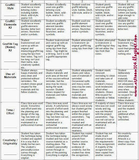
Here are the Art 7 student's initial tag designs and the rubric I used to grade them.  I saw a really great display on the Art Teacher Facebook page a while back where the teacher created a fake brick wall to attach the tags too.  Originally I thought I would have them tag their portfolio and their sketchbook, but after I saw that post on Facebook, I changed my mind.  I made a similar brick wall and had the students do their tag first on paper, cut it out and place it on the wall.  Students used markers, colored pencils and the Crayola Marker Airbrush pumps I purchased last year from Nasco with grant money.  (Unfortunately, between the constant use and students not taking care of them very well during this project, I think I am down two out of six air brush pumps...not sure if it's really because the students were rough on them or if it's the quality of the pumps themselves...)


I passed back the graded rubrics and asked students to reflect on their tags.  Their last homework assignment was to finalize and redraw their tags using my feedback from their rubric.  For example, some students used their first name and didn't brainstorm an actual tag nickname...others only used letter text and did not have any flourishes, symbols or arrows.  Here are the final sketchbook tags in progress (these are aiming to be more of a "piece" than just a tag) as well as the rubric I will be using to grade them...students have spent two days so far and as of today, I have four that are finished...they will all get one more day and then the unit test for graffiti.  Then we'll FINALLY be able to move onto the next unit, which will be perspective!


Just wanted to share my bulletin board display of fall artwork...I decided to display the fall birch trees and pastel pumpkin patch drawings together!


Thursday, October 24, 2013

3rd Grade: Fall Birch Trees

The next finished elementary project is another oldie but a goodie...the fall birch trees in 3rd grade.  I also happened to have my first observation this year during this lesson and it went swimmingly well! As with the 1st grade pumpkin patch drawings, I've blogged about this project before, so I won't get into too much detail about how we did them.  I will say, however, that instead of using pan watercolor paint (or liquid watercolor), we used watercolor pencils this year, which was a first for me.  Watercolor pencils was a new thing I added to my requisitions this year and the kids loved using them!

Basically, we taped off our birch trees, drew in our horizon lines, added details, colored with the watercolor pencils, painted over with water, ripped the tape off, scraped the birch tree lines and then dabbed the fall leaves...phew!


Wednesday, October 23, 2013

1st Grade Oil Pastel Pumpkin Patch Drawings

FINALLY we have finished our first project in 1st grade!!!  Our oil pastel pumpkin patch drawings are now complete!  This is a project I blogged about last year and we followed the same procedures as last year, which you can read about in this post.

On the first day, we did two pumpkin drawings....the first was for students to show me how they drew pumpkins and the second (on the back side of the paper) was where I showed them how to draw more realistic pumpkins.

On the second day, we talked about depth and using multiple horizon lines.  We also talked about size.  We drew our pumpkin patch with fall details using white oil pastels and then started to color them in.  We used the third day to finish coloring these.


Coming up next will be a skeleton project for the Day of the Dead (which also links to the NYS Common Core Listening & Learning strand about the human body in 1st grade!).