Thursday, October 9, 2014

More Artist Bell Ringers & Sketchbook Use

A week or so ago, I posted about how I am using sketchbooks this year in my Studio class.  I am going to add to that article by posting the latest things we've added to our sketchbooks IN CLASS via bell ringers and classwork.

First off, students did have a sketchbook assignment over the weekend a few weeks ago...but only because it pertained to what they were doing in class.  Students were completing the zentangled master's project (I will be sharing the completed ones from this year in the next few days), so I had them practice zentangles by zentangling a random object.  (Mine is the camera!)

Along with the zentangle project, students had to create a page in their sketchbook to doodle, practice and make notes about their main project.  I printed out a copy of each person's original painting.  Some students decided to grid it, so I had them tape transparency paper over the original.  I encouraged students to try out different zentangles on that page before putting them on their final drawing.
Eventually, I want to start photographing student progress periodically throughout the project and have students past the photograph into their sketchbook.  I'll then have them reflect via bell ringer on what they want to accomplish during the week on the project, what they might be wanting to change, what they are having a hard time on, etc.

We are currently onto our next unit, which is 2-D media, focusing on drawing.  In an effort to cut down on the notes I had students take last year in their note packets, I'm trying to transfer a lot of these notes into class activities in the sketchbook.  The first one we've done is this value page.  Students had to create a value scale, a shaded cube, and write the name and definition for each of the four shading techniques (blending, hatching, cross-hatching, and stippling).  What's great about this being in the sketchbook is that it's less paper I have to copy and waste and it's always in their sketchbook as a reminder of what value is for homework sketch assignments.

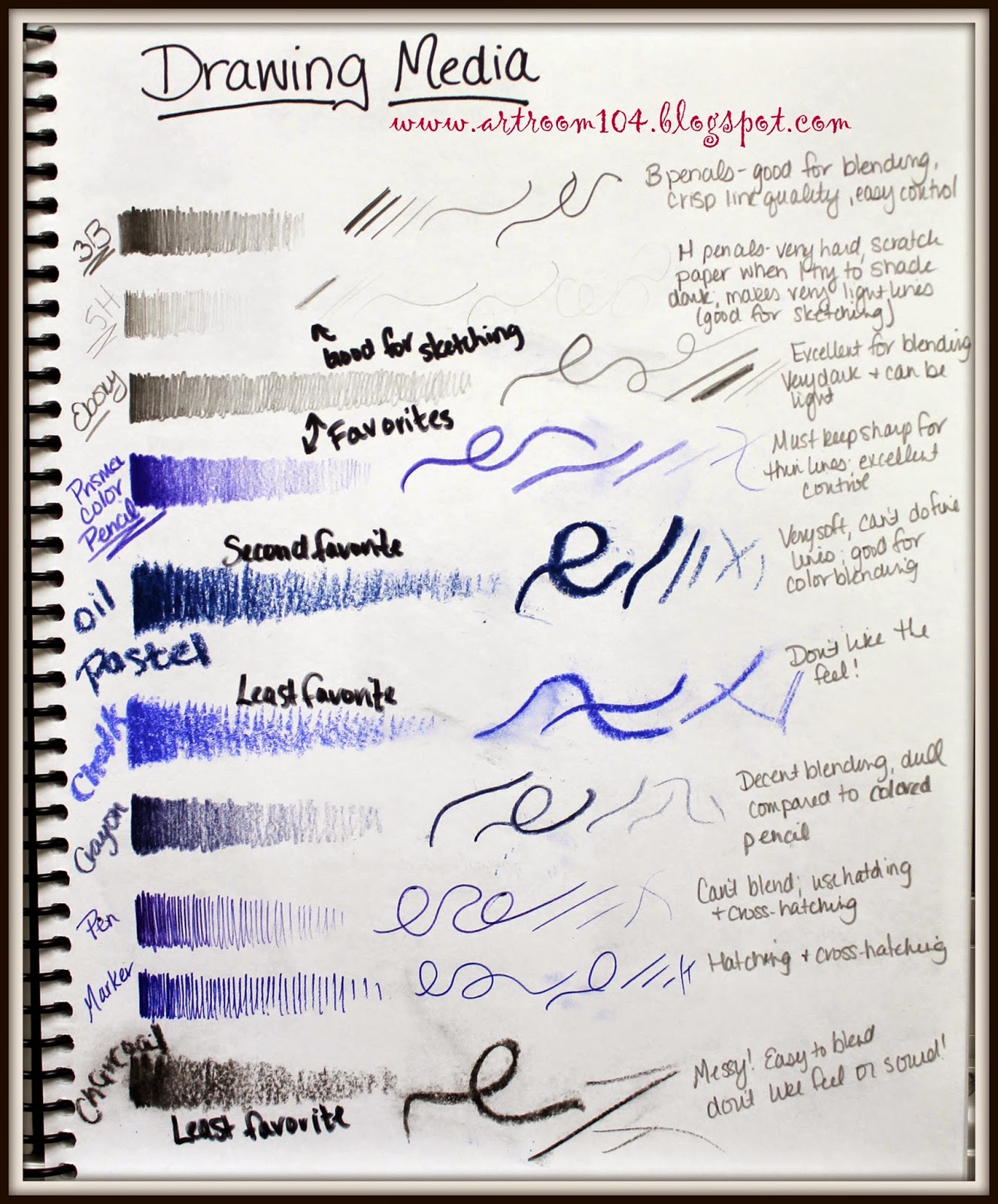
I've gone ahead and done the next classroom activity in my sketchbook...the students have not done this yet.  Our current project, which we are officially starting Monday, is going to be self-portraits done on a grid system using words as value (micography)...hence the value practice.  Our next project will be to practice doing observational drawings using the art mannequins.  Last year, I had students to their art mannequin drawing using only pencil or Sharpie, however this year I want to be more flexible.  Therefore, I will be having the students create a "Drawing Media" page in their sketchbook.  They will have to create a simple value scale, draw a variety of lines, label each medium, and make some notes (i.e. Do you like the medium? Which is your least favorite and most favorite and why?  Do you think a certain type of drawing medium is better for one type of drawing than another? etc.)

And finally, here are some artist bell ringer pages that we have completed.  I have decided that I am going to do a different artist every other week so that I can use bell ringers to review other material.    We already did Piet Mondrian, and next came Joan Miro.  I have decided on this set "schedule" for these weekly artist bell ringers:

Day 1: Students copy down some brief biographical information and paste a picture of the artist and one artwork by the artist into their sketchbook.
Day 2: Students paste two more artworks with the credit lines.
Day 3: Students paste one artwork with credit line and then must make a list of characteristics that they observe about that artist's work.  I always go over this to make sure we are on the same page once everyone has it completed.
Day 4: Students receive two paintings to paste into their books.  They must tell me which one is by the artist and two reasons why.
Day 5:  I ask students to do a quick, 2-minute sketch of design that is inspired by the artist.


This week's artist is Chuck Close.  We have one more day of bell ringers for him.  I choose to do Chuck Close right before we do our self-portrait project because we are going to be using a grid system to do our initial drawing.

The students are slowly getting better and better with these bell ringers.  I'm finding that I am teaching them note-taking and organizational skills at the same time.  I know a lot of these students must take notes on their own in other classes, but I am unsure if they actually know the proper way to keep an organized note page or if they just aren't connecting that knowledge from other areas to what I am doing with these bell ringers in art.  Either way, I hope by the end of the year, each student will be able to have nice, neat, concise note pages for each artist!

Tuesday, October 7, 2014

Sculpture: Altered Books

The first project my sculpture class completed was an altered book project.  I should students a bunch of examples of altered books that have been cut, folded, painted, drawn on, etc.  They received a project sheet with the basic guidelines and the rubric.  Currently my elective has 16 students in it!!!  I'm trying to keep the Common Core stuff to a minimum (gasp!) so that I can keep my enrollment up.  After all, this is an elective class that students are choosing to take instead of a study hall...I've got to give them props somehow!  

Here is the project page and rubric students received:

And here are the finished products!  A few students struggled with this...particularly the ones who added the class two weeks into school and then tried to rush to get caught up.  I'm hoping they will redeem themselves on the next project we've started...paper mache taxidermy!  I'll share progress photos soon!
Some students wanted to paint their sculptures.  I brought out spray bottles and liquid watercolor paint for them to spray.

This student meticulously cut out the piano from her pages using a template and then painted it with acrylic.

More watercolor...


This person used some copper foil to add to his book.  Unfortunately, he went a little overboard with the origami bird.  Originally it was done in paper and was colored purple with marker...it looked much better then.


Monday, October 6, 2014

1st Grade Crazy Pumpkins, Part 2

Here they are...our finished crazy pumpkin collages!


Some students elected to add crazy eyes and mouths to their pumpkins to create jack-o-lanterns while others decided to keep them simple pumpkins.  To finish up the collages, I passed out white drawing paper scraps for students to create eyes, mouths and as some did, moons to add to their collages.  I passed out a piece of brown art paper for them to make stems.  Once these were all glued on, students added a few more blades of grass from their green paper scraps and they were all finished!


Wednesday, October 1, 2014

3rd Grade: Georgia O'Keeffe Landscapes

Ok, this is a project that I have been waiting AN ENTIRE YEAR to do!  I saw it on my blog roll via Painted Paper while I was in the middle of my usual fall birch tree paintings with 3rd grade.  I usually do a fall, winter, and spring birch tree project with that level in order to teach depth in a landscape but I wanted to change it up a bit this year.  I really love the birch trees but I am actually getting tired of doing them so I switched to this project for the fall landscape.  What's great is that it only took us two class periods to complete these, whereas the birch tree paintings take 3-4, and when you only see the students once every six days, that's a lot of time to stretch out a project.


This is also an awesome project to do because I live in Northern New York, not very far from Lake George where Georgia O'Keeffe painted these!  Many of my students have been there on vacation so it was a way for them to connect to O'Keeffe and the project we were doing.

I basically took the directions for this project verbatim from Painted Paper.  After I presented Georgia O'Keeffe using a power point, we discussed depth and how to make things look farther away or closer to you in a painting.  On that same day, we painted the sky first using light blue paint and we dabbed white in to make clouds.  Next, we left a space and painted the water using dark blue.  I showed students how to streak in white and black to give the illusion of light reflecting off the lake.  Lastly, we added mountains in between the water and sky using brown and a little bit of black paint.

On the second day, we talked about depth again.  We looked at O'Keeffe's fall landscape again and then observed the trees outside the classroom, noticing the difference in details that can be seen in the trees right outside the window versus across the street.  I demonstrated how to dab the yellow and red paint together to create fall trees (also a quick review on primary and secondary colors!).  Some students chose to add a thin line of trees at the base of the mountain.  Once they finished the trees, I had them get a skinny paint brush to add tree trunks and branches to the foreground trees.

My example, from start to finish.