Showing posts with label blending. Show all posts

Thursday, January 29, 2015

Oil Pastel Jungle Animals

I LOVE this project!  It's definitely a staple in my room now for 5th graders to do this project.  Their classroom teachers love it (because they draw the animal they research for class) and the students love it because they tend to be so successful with the oil pastels!  I even had one of the teachers ask me if she could have a box or two of oil pastels for the students to draw with in their spare time in their classroom! :)

We did this project last year, and it didn't really change at all.  I printed off a picture of each student's animal for them to use as a resource to draw from.  I demonstrated how to blend oil pastels together and how to create different textures, such as rock, leaf, water, and fur.  We also talk about using complementary colors to create value, not just black and white.

Here are some of this year's results!  LOVE LOVE LOVE!


There were so many students who normally turn in rushed, sloppy artwork that did amazing!  I have to admit, I'm one of those bloggers who tends to only upload and share the good work...and this time around, there are student's artwork posted that often never get considered!

Monday, January 12, 2015

1st Grade: Winter Landscapes with Depth

My 1st graders finished up these awesome winter landscapes right before we left for the winter break.  I really like introducing the concept of depth to 1st grade because I think they can actually understand it and work with it in simpler forms.  In the past, I've done pumpkin landscapes with depth and a Northern Lights landscape, so I decided to combine the two for this year's depth landscape!

This project took two days and about 10 minutes in a third class to complete.  On the first day, I showed students a video about how the Northern Lights are created (of which this fits really well into their Common Core Listening & Learning strand about Astronomy!).  We then got down to work drawing our landscape out.

Students used black oil pastel on black paper.  I first asked them to draw a big snowman, just the body, towards the bottom edge of their paper, and then a horizon line behind it.  I posed the question, "If you wanted to draw a snowman in the background, how would you do it?"  Most of them understood that it had to be drawn smaller, but I showed them how to draw it smaller and farther up on their paper.  Again, I had them draw a horizon line behind that snowman.  Then, I asked, "What if you wanted to draw a snowman in between those two snowmen? In the middle-ground?" It was like a light-bulk turned on above their heads! 

We added the mountains next, and then used three colors to create the Northern lights in the sky.  This all happened on day 1.

On day 2, we talked about how we were going to color all the snow.  If snowmen are white, and the snow on the ground is white, I explained that they would have to do something a little different to the snow so they wouldn't blend together.  Luckily, there was snow on the ground outside the windows so we could look at how the shadows from the building look blue in the snow!

After the snow was colored, the mountains and the details on the snowmen were the last things left!


Thursday, January 8, 2015

3rd Grade: Wayne Thiebaud Cake Drawings

Hopefully I'm going to be playing catch-up these next few days!  I've got SO MANY projects to share from before the winter break, it's not even funny!  Things have been insanely hectic with the holidays, conferences, and committees at school.  I also recently became a consultant for Jamberry in order to help pay medical bills from last year.  My blog has unfortunately taken a back seat to all of these things, but it's my goal to make sure that stops happening!

This next project I'm going to share is probably one you've seen on Pinterest.  My students in 3rd grade LOVED making these oil pastel Wayne Thiebaud cakes!  (Did you know his last name is pronounced "tee-bow"?  Like the football player?  I didn't until I presented this project!).  This is the first time I've used this artist as a reference in my classes, and the students just loved it.  I find that they always love oil pastels anyways, because it's so easy for them to be successful with color blending and value, but the added fact that they were designing cakes like the Cake Boss just made it even cooler!
I am in LOVE with this one!  There is a local, elementary art show coming up and I wasn't sure if I'd have four pieces to send to it, but I do believe that this one may be going! :)

This project even correlates with Common Core math, as students were turning basic shapes into 3-D forms.  We used vocabulary such as cylinders and cubes to describe the shapes of our cake tiers.  Students practiced drawing their cakes on a worksheet for the first day.  Then, they drew them on 12"x18" black paper the second day, and I demonstrated how to blend the colors together on the cake tiers, adding in a little black for shadows.  On the third day, students finished their tiers and colored the background, finishing them up!


Thursday, October 9, 2014

More Artist Bell Ringers & Sketchbook Use

A week or so ago, I posted about how I am using sketchbooks this year in my Studio class.  I am going to add to that article by posting the latest things we've added to our sketchbooks IN CLASS via bell ringers and classwork.

First off, students did have a sketchbook assignment over the weekend a few weeks ago...but only because it pertained to what they were doing in class.  Students were completing the zentangled master's project (I will be sharing the completed ones from this year in the next few days), so I had them practice zentangles by zentangling a random object.  (Mine is the camera!)

Along with the zentangle project, students had to create a page in their sketchbook to doodle, practice and make notes about their main project.  I printed out a copy of each person's original painting.  Some students decided to grid it, so I had them tape transparency paper over the original.  I encouraged students to try out different zentangles on that page before putting them on their final drawing.
Eventually, I want to start photographing student progress periodically throughout the project and have students past the photograph into their sketchbook.  I'll then have them reflect via bell ringer on what they want to accomplish during the week on the project, what they might be wanting to change, what they are having a hard time on, etc.

We are currently onto our next unit, which is 2-D media, focusing on drawing.  In an effort to cut down on the notes I had students take last year in their note packets, I'm trying to transfer a lot of these notes into class activities in the sketchbook.  The first one we've done is this value page.  Students had to create a value scale, a shaded cube, and write the name and definition for each of the four shading techniques (blending, hatching, cross-hatching, and stippling).  What's great about this being in the sketchbook is that it's less paper I have to copy and waste and it's always in their sketchbook as a reminder of what value is for homework sketch assignments.

I've gone ahead and done the next classroom activity in my sketchbook...the students have not done this yet.  Our current project, which we are officially starting Monday, is going to be self-portraits done on a grid system using words as value (micography)...hence the value practice.  Our next project will be to practice doing observational drawings using the art mannequins.  Last year, I had students to their art mannequin drawing using only pencil or Sharpie, however this year I want to be more flexible.  Therefore, I will be having the students create a "Drawing Media" page in their sketchbook.  They will have to create a simple value scale, draw a variety of lines, label each medium, and make some notes (i.e. Do you like the medium? Which is your least favorite and most favorite and why?  Do you think a certain type of drawing medium is better for one type of drawing than another? etc.)

And finally, here are some artist bell ringer pages that we have completed.  I have decided that I am going to do a different artist every other week so that I can use bell ringers to review other material.    We already did Piet Mondrian, and next came Joan Miro.  I have decided on this set "schedule" for these weekly artist bell ringers:

Day 1: Students copy down some brief biographical information and paste a picture of the artist and one artwork by the artist into their sketchbook.
Day 2: Students paste two more artworks with the credit lines.
Day 3: Students paste one artwork with credit line and then must make a list of characteristics that they observe about that artist's work.  I always go over this to make sure we are on the same page once everyone has it completed.
Day 4: Students receive two paintings to paste into their books.  They must tell me which one is by the artist and two reasons why.
Day 5:  I ask students to do a quick, 2-minute sketch of design that is inspired by the artist.


This week's artist is Chuck Close.  We have one more day of bell ringers for him.  I choose to do Chuck Close right before we do our self-portrait project because we are going to be using a grid system to do our initial drawing.

The students are slowly getting better and better with these bell ringers.  I'm finding that I am teaching them note-taking and organizational skills at the same time.  I know a lot of these students must take notes on their own in other classes, but I am unsure if they actually know the proper way to keep an organized note page or if they just aren't connecting that knowledge from other areas to what I am doing with these bell ringers in art.  Either way, I hope by the end of the year, each student will be able to have nice, neat, concise note pages for each artist!

Wednesday, October 23, 2013

1st Grade Oil Pastel Pumpkin Patch Drawings

FINALLY we have finished our first project in 1st grade!!!  Our oil pastel pumpkin patch drawings are now complete!  This is a project I blogged about last year and we followed the same procedures as last year, which you can read about in this post.

On the first day, we did two pumpkin drawings....the first was for students to show me how they drew pumpkins and the second (on the back side of the paper) was where I showed them how to draw more realistic pumpkins.

On the second day, we talked about depth and using multiple horizon lines.  We also talked about size.  We drew our pumpkin patch with fall details using white oil pastels and then started to color them in.  We used the third day to finish coloring these.


Coming up next will be a skeleton project for the Day of the Dead (which also links to the NYS Common Core Listening & Learning strand about the human body in 1st grade!).

Tuesday, September 24, 2013

Studio Art: Unit 2 Begins...2-D Media

My first unit lasted about as long as I had hoped it would, and on Friday we began our second unit.  Our second unit is all about 2-D media...drawing, painting and printmaking.  I am also combining art criticism with this unit.  The textbook I am using has art criticism as its own unit, but there is no way I'm going to spend an entire week or two just on art criticism...that's something we can work on over the school year to perfect, a little at a time.  The students have also been antsy to get started on a "real" art project.

The cover of my unit 2 note packet...stay tuned to the SmARTteacher website...my unit is posted there now!


On Friday, I introduced/reviewed value and the four common shading techniques with the students: hatching, cross-hatching, stippling and blending.  They had to practice in their notes and then for their second sketchbook assignment, I asked them to set up a 3-object still life at home, shine a light on it, and draw it using value.
This is the generic sketchbook assignment rubric I have created for the weekly sketch assignments.  Each student has now seen this and will have their Friday sketch assignments graded according to this rubric every Monday.  So far, I think I'm happy with it...but we'll see if I feel like I need to make any changes to it.

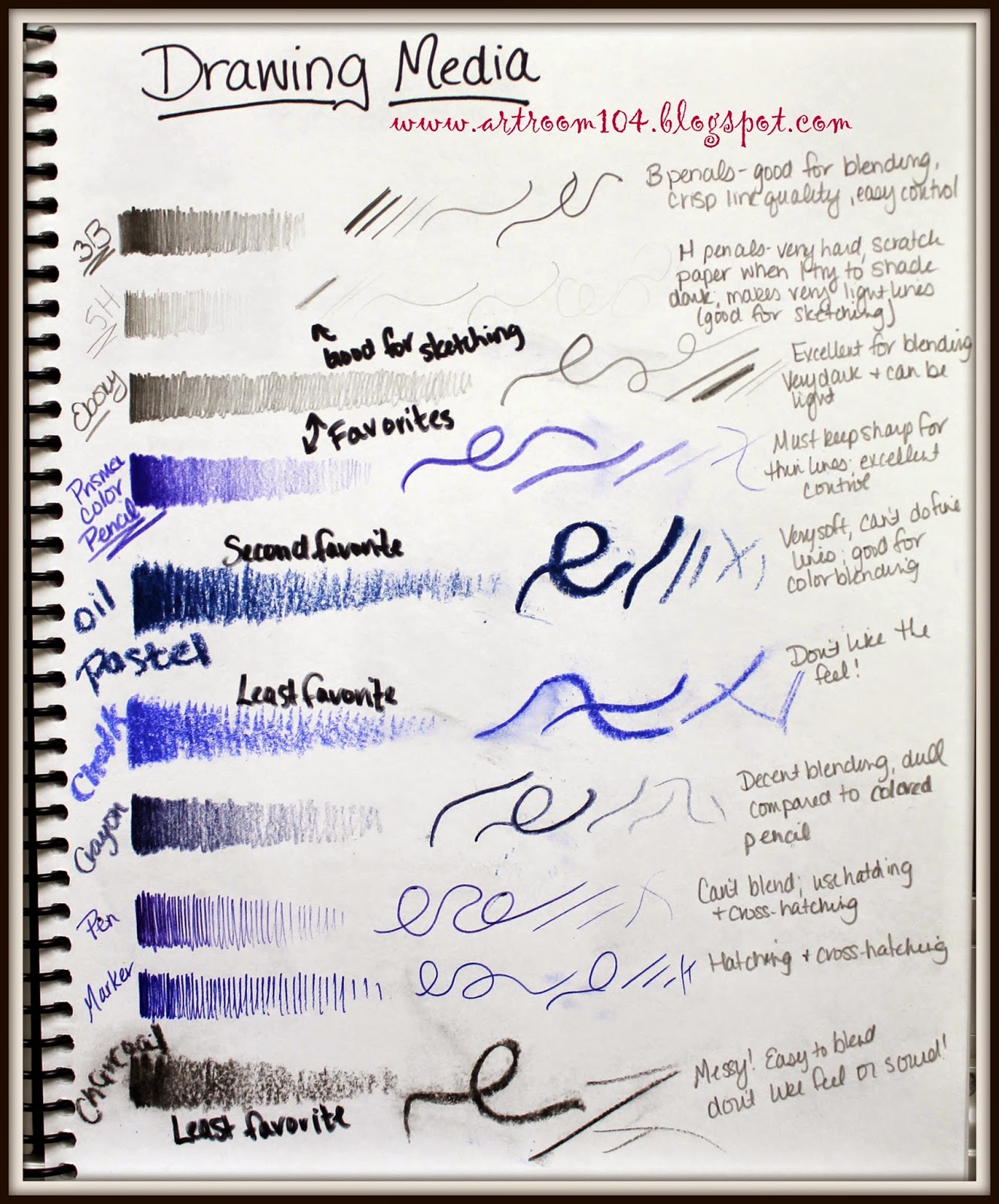
On Monday, we started off the unit by discussing the different drawing media that can be used (oil pastels, pencil, chalk, etc.) and we spoke briefly about art styles.  Again, this is something we will work on throughout the school year, but the projects we do for this unit are all going to fall under the realm of pop art, so I want students to have a basic knowledge of what pop art is compared to the other styles of art.
In the back of my packet, I put colored copies of these paintings.  We cut them out, and then one at a time, we talked about which style they thought these fell under.  Quite a few students new some of the more popular artworks here and knew the styles (although when I had them in 6th grade, they had to do a group research project on an artist...I found it quite wonderful that a lot of them retained the information!).

 Now, as I graded those sketch assignments on Monday, I realized that the students (a) didn't have a good idea of what I meant by set up a still life and (b) didn't know how to properly utilize value with observation skills.  Thus the reason why it's important to give sketch assignments as homework (a good way to assess prior knowledge!).  I threw out my original plans for the next few days and pulled out the mannequins I bought for the elementary room with past SmARTteacher winnings.  I set them up in the middle of the tables, let the students arrange them, turned the lights off and put a spot light on the figures.  I gave a brief demonstration of how they should quickly do a contour drawing of the figures and then demonstrated the proper way to observe value.
The students REALLY enjoyed doing this and asked if we could work on it again tomorrow...heck yes!

I found that they did okay observing the shadows and high lights, but they had a tendency to just give a dark and light value.  I went around to each student and asked if I could show them on their drawing how I wanted them to exaggerate what they saw and make more of a range of values, from black to white and everything in between.  Once they saw how much their drawings started to pop, they were really excited!

Tomorrow, I am going to give each student a large piece of drawing paper and an ebony pencil.  I envision having them do multiple drawings of the figures on one sheet of paper...a super huge close up of a figure that goes from top of the page to bottom...smaller figures that go off the page, etc.  Just a montage of mannequins!
 --------------------------------------------------------------------------------------------

Once we move on from practicing the value (probably by Thursday or Friday this week), students will have to bring in a wrapped food item, such as a candy bar, and do a large, up-close black and white drawing of it.
As we move onto the painting aspect, students will learn about how paint is made and we will then use our candy bars and acrylic paint to do a pop art painting...I'm thinking more in the style of Claes Oldenburg.  I want them to incorporate some acrylic mediums that I bought to give their paintings texture.  This project will be a way for students to utilize the elements and principles to create an interesting composition.

For the final 2-D project, printmaking, students will do some reduction printing ala Andy Warhol.   I did this with my printmaking class when I did my student teaching, and I have my example hanging on a bulletin board in the high school art room that students were admiring and mentioned they wanted to do (I hung up some of my artwork from the past, both high school and college, so that students could see what I am capable of).  So, I'll have students bring in a popular object to turn into a multi-colored print.

This unit will also introduce art criticism to the students.  That was originally what I was going to start with, but I was tired of doing the note thing, and so were the students.  I prefer getting the boring stuff out of the way in the beginning, but I need to remember that the students don't think that way!